Textured wall art gives a room something flat prints can’t: visible evidence of a hand at work. Thick brushstrokes, raised impasto ridges, and a surface that catches light differently as you move past it — this is art that rewards a second look and, ideally, a closer one. This guide covers 11 proven rules for where textured wall art works, how to tell genuine dimensional texture from a printed imitation, and how to style it for maximum tactile impact.
Textured wall art occupies a specific niche in interior design — it’s the style most likely to make someone stop and touch a wall, which is precisely the point. Where flat prints ask to be seen, textured wall art asks to be experienced, and that difference in how a piece is encountered is what gives a room built around it a genuinely handcrafted feel.
This guide walks through textured wall art room by room, the difference between genuine canvas texture and a printed imitation, and how to pair it with the tactile fabrics and materials that let it do its best work.
Textured Wall Art for Living Rooms
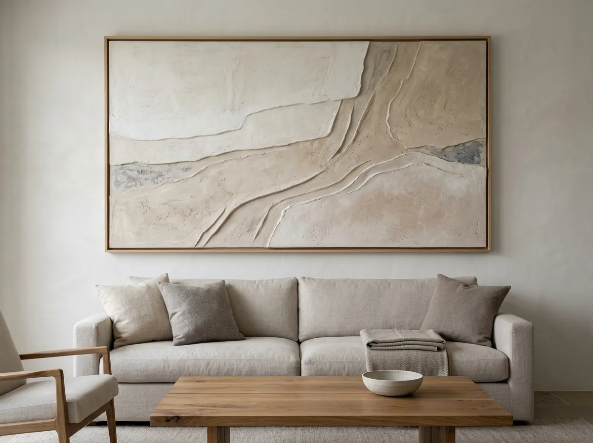
The living room is where textured wall art has the most opportunity to shine, provided it gets the side or angled light that makes its dimension actually read. A large-format Impasto Linen piece above a sofa gives the room a focal point with genuine physical presence, not just visual interest.
For open-plan living spaces, a single large-format textured piece can anchor the seating area visually, since its dimensional surface reads clearly even from the far side of an open floor plan in a way a flatter, more detailed print sometimes doesn’t.
Textured Wall Art for Kitchens
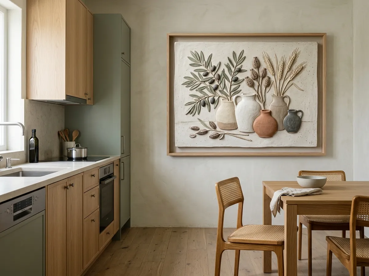
Kitchens increasingly function as living spaces rather than purely utilitarian ones, especially in open-plan homes, which makes an open feature wall — away from the stove, sink, or backsplash — a genuine opportunity for textured wall art rather than an afterthought. Pendant lighting over an island or breakfast nook often already casts exactly the kind of warm, angled light that lets genuine surface texture read clearly.
The tactile quality of textured wall art also pairs naturally with the organic modern materials many kitchens are already built around — butcher block, open wood shelving, unglazed ceramics — making it a more cohesive addition here than a flatter, glossier print might be.
Textured Wall Art for Bedrooms
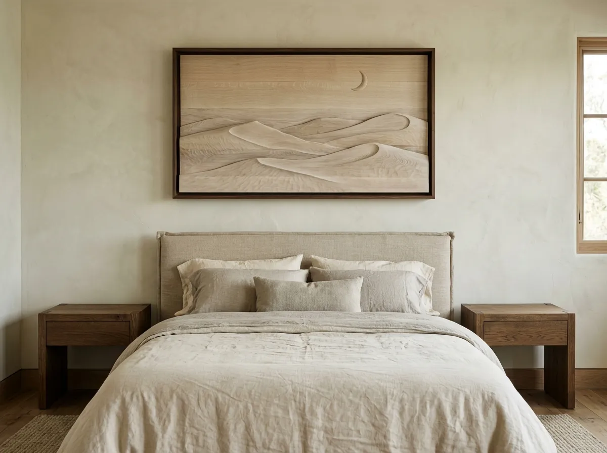
In a bedroom, textured wall art gives a restful, neutral-toned room warmth and depth without introducing bold colour that might disrupt a calming palette. A single piece above the headboard, sized to 75–80% of the headboard’s width, adds tactile richness that pairs naturally with layered bedding and soft furnishings already common in bedroom styling.
Softer, less contrast-heavy pieces of textured wall art tend to suit bedrooms better than more dramatic, high-contrast options, which can feel visually active in a room meant to support rest. The texture itself provides enough visual interest without needing bold colour or pattern alongside it.
Bedside lamps, positioned at an angle to the headboard wall, do double duty here — providing reading light while also casting the kind of side illumination that lets a textured piece’s surface dimension read clearly in the evening.
Textured Wall Art for Reading Nooks
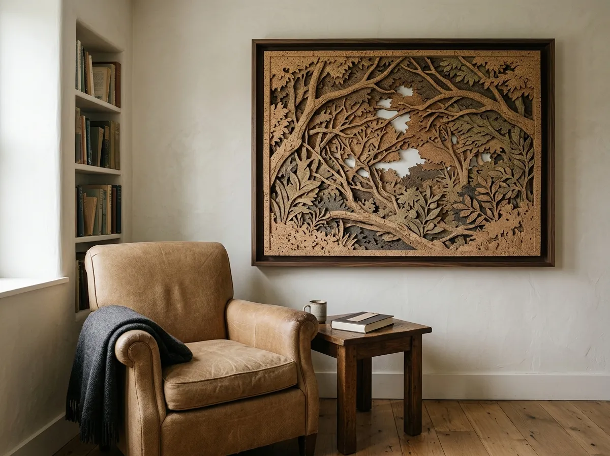
A reading nook is arguably the single best-suited spot in a home for textured wall art, since it’s a space built entirely around close, extended, unhurried attention — exactly the viewing condition the style rewards most. A piece positioned at seated eye level beside the chair invites the kind of closer look that art across the room from a sofa rarely gets.
Because a reading nook is already anchored by a table or floor lamp for practical reading light, that same fixture can be angled to double as the side lighting that makes genuine texture read clearly in the evening — no separate lighting upgrade required.
What Creates Genuine Dimension in Textured Wall Art
Genuine canvas texture wall art relies on actual surface variation — raised ridges, visible brush or palette-knife marks, and the natural weave of the canvas itself showing through the paint or print layer. This is fundamentally different from a flat print with a texture pattern rendered digitally into the image, which looks convincing in a photograph but reads as flat the moment it’s viewed in person and up close.
MutedCanvas’s Impasto Linen technique is built specifically around this distinction — the printing and canvas process is chosen to preserve real dimensional variation in the final piece, rather than simulating texture purely through the printed image. This is what allows genuine canvas texture wall art in this style to hold up under the raking-light test described earlier, where a flat imitation would fail.
Textured Wall Art — Brushwork Versus Flat Imitation
Painterly wall art describes a broader category than texture alone — compositions that read as painted rather than photographed or digitally rendered, whether or not the final piece has actual raised texture. Visible brushstroke direction, varied paint density, and imperfect edges all contribute to a painterly quality even before texture enters the picture.
The strongest painterly wall art combines this compositional quality with genuine surface texture, since the two reinforce each other — visible brushwork that’s also physically raised reads as considerably more convincing than either quality alone. For painterly wall art specifically, look for variation in brushstroke direction and density across the composition rather than a uniform texture pattern applied evenly throughout.
The Craftsmanship Revival Behind Textured Wall Art
Interest in textured wall art sits within a broader shift toward visible craftsmanship in interior design. A recent survey of design professionals found designers increasingly drawn to vintage and antique pieces specifically for their inspiration and quality of craftsmanship, even as the same survey found the large majority of designers report 2025 tariffs have affected their sourcing decisions — a combination that’s pushed many toward pieces that can be produced without the same import exposure, while still carrying a handmade, considered quality.
Textured wall art fits neatly into this shift: a digital download print can be produced domestically wherever it’s ordered, sidestepping the sourcing and tariff exposure of imported furniture or antiques, while the genuine surface texture still delivers the tactile, handcrafted quality clients are increasingly asking for.
Pairing Textured Wall Art With Tactile Materials
Textured wall art reads most cohesively in a room that already has some tactile richness elsewhere — boucle, raw linen, chunky knit throws, and unfinished or lightly finished wood all share the same emphasis on surface quality that the art itself is built around.
Where a room is otherwise quite smooth and polished — lacquered surfaces, glass, high-sheen fabrics — textured wall art can still work, but reads as more of a deliberate contrast than a natural extension of the room’s existing tactile language. Textured wall art also pairs well with matte, low-sheen framing rather than high-gloss finishes, since a glossy frame can visually compete with the texture of the piece itself.
Which Interior Styles Suit Textured Wall Art
Textured wall art works across a wide range of interior styles, since tactile richness is a quality most design languages can accommodate somewhere.
Organic modern — textured wall art is close to a signature element, pairing naturally with the raw materials and handmade quality this style prioritises. Rising demand for natural, wellness-oriented interiors is cited as a growth driver across residential and commercial design, a shift that favours exactly this kind of tactile, handcrafted-feeling art.
Warm minimalism — a single textured piece adds depth to a pared-back, neutral room without introducing colour or visual clutter.
Maximalist and eclectic — textured wall art contributes another layer of tactile interest within an already richly layered room.
Traditional and transitional — the visible brushwork of painterly, textured pieces sits comfortably alongside classic furniture forms and materials.
Scale and Placement for Textured Wall Art
Textured wall art follows the same general sizing formulas as other styles — 60–75% of sofa width above a living room seating area, 75–80% of headboard width in a bedroom — but benefits more than most from being viewed at a range of distances, since part of its appeal only reveals itself up close. Standard files run up to the 24×36 inch full-quality ceiling; a wall that genuinely needs more can use a same-technique triptych rather than an oversized single panel.
Hanging height follows the standard 57-inch centre-height convention for most standalone placements. In spaces where people frequently sit or stand close to the piece — a reading nook, a kitchen breakfast wall — a slightly lower placement can invite the closer inspection the style rewards. Lighting placement matters more for textured wall art than for flatter styles, since the shadow play created by side lighting is central to how the texture reads.
What to Avoid With Textured Wall Art
Flat imitation texture. A digitally rendered texture pattern on an otherwise flat print looks convincing in photographs but reads as artificial once viewed in person under angled light.
Direct, flat-on lighting only. Without some side or angled light, the shadow play that makes genuine texture read is largely lost, regardless of how much real dimension the piece has.
High-gloss framing. A glossy frame finish competes visually with the piece’s own surface texture rather than letting it read as the room’s primary tactile element.
Uniform texture patterns. Genuine painterly and canvas texture wall art has organic variation in brushstroke direction and density; a single repeated pattern applied evenly is a sign of simulated rather than genuine texture.
Undersizing. A textured piece too small for its wall loses impact just as any undersized art does, and additionally makes its tactile quality harder to appreciate from a normal viewing distance.
Textured Wall Art by Room — Complete Styling Guide
The table below maps common rooms to sizing, lighting, and placement guidance for textured wall art.
| Room | Sizing Approach | Lighting | Placement Note |
|---|---|---|---|
| Living room | 60–75% of sofa width | Side or angled natural/lamp light | Above sofa, away from flat overhead-only light |
| Kitchen | Medium to large, up to 24×36″ | Warm pendant / angled light | Open feature wall, away from splash zones |
| Bedroom | 75–80% of headboard width | Angled bedside lamp light | Softer, lower-contrast pieces |
| Reading nook | Medium, seated eye level | Angled reading-lamp light | Close-proximity viewing encouraged |
Recommended Products for Textured Wall Art
Everything you need to light, frame, and install textured wall art so its genuine dimension actually reads.
- Browse our complete Wall Art Ideas guide for every space
- See our Muted Canvas and Moody Interiors guide for a tonally related, cooler technique
- Read our Interior Design Wall Art guide for sourcing craftsmanship-forward pieces for client proposals
- See our Gold Wall Art guide for another richly tactile, high-contrast style
Frequently Asked Questions
Textured Wall Art That Rewards a Closer Look
The rooms where textured wall art works best share a consistent pattern: genuine surface dimension rather than a printed imitation, some side or angled lighting to let that dimension actually read, and enough proximity in daily use — a reading nook, a kitchen breakfast wall, a spot near a sofa — for people to notice the tactile quality up close, not just from across the room.
It’s a style built on reward for attention, which makes it a natural fit for the spaces in a home where people actually linger. Start with the lighting — get one side or angled source right, and the texture does the rest of the work itself.
Shop Impasto Linen Prints →