Wall art ideas are not in short supply. What is in short supply is specific, honest guidance on what actually works in a given room — and why. This is that guide: wall art ideas for every space, organised by room, light condition, and function rather than by trend or aesthetic preference.
The global wall art market was valued at approximately USD 63.6 billion in 2024, and it continues to grow steadily. More people are buying art than at any previous point, driven by accessible digital printing, growing awareness of interior design, and a renewed emphasis on how the spaces we live and work in actually feel.
This guide covers universal principles that apply to every wall art idea regardless of room, followed by specific guidance for twelve room types, and a full breakdown of which techniques suit which spaces. If a room isn’t covered in full depth here, it links to a dedicated guide that goes further.
Universal Wall Art Ideas: The Principles That Apply Everywhere
Every room is different, but the principles that govern which wall art ideas work in a space are consistent. Before choosing any specific piece for any specific room, three questions determine whether the choice will work.
What is the room’s primary function? A bedroom exists for rest and recovery — wall art that introduces visual energy or high contrast works against the room’s purpose. A living room exists for social gathering and relaxed attention — wall art can afford more presence and more compositional complexity. A home office exists for sustained concentration — the best wall art ideas for it support attention recovery without demanding active visual engagement. Function before aesthetics, always.
What is the light quality? North-facing rooms with cool, indirect light need warm-palette wall art to avoid reading as cold and draining. South-facing rooms with abundant warm light can absorb darker, more tonal work without it feeling heavy. East-facing rooms with morning light suit warm botanical and impressionist prints. West-facing rooms with afternoon directional light suit monochrome and tonal work that shifts beautifully under raking light.
What is the dominant wall colour and material palette? Wall art ideas do not exist in isolation. A muted sage wall needs art in a compatible colour temperature — warm linen tones work, cool blue-greys compete. A room with substantial wood furniture and warm materials needs art that reads in the same tonal family. Colour-matching here is not about matching exactly — it is about belonging to the same temperature.
Wall Art Ideas: Sizing Rules That Apply in Every Room
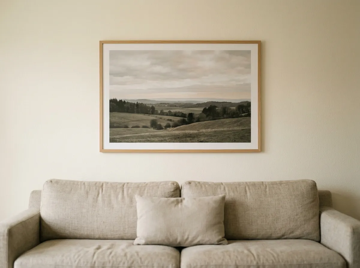
Scale is the single most common source of failure in wall art ideas. A print that looks correct on a screen almost always reads as too small on a wall. The eye needs art to fill a meaningful proportion of the available visual space — not the entire wall, but enough of it that the piece reads as a considered choice rather than a postcard.
The most widely used professional sizing rule is the two-thirds guideline: a piece of wall art hung above furniture should span approximately two-thirds of the furniture’s width. Above an 80-inch sofa, the art should be roughly 52 inches wide. Above a 64-inch bed headboard, roughly 44 inches wide. Above a 48-inch dresser, roughly 32 inches. This proportion is used consistently by interior designers and holds up across virtually every room type.
For wall art on an empty wall with no furniture below it, the principle shifts to proportion of the wall itself. A piece should fill between 40% and 60% of the wall’s width. On a 10-foot-wide wall, this means art between 48 and 72 inches wide — as a single piece, a diptych, or a gallery arrangement whose total span falls in that range.
Hanging Height for Wall Art Ideas in Every Room
The museum-standard hanging height is 57 inches from the floor to the vertical centre of the artwork, a rule used by MoMA and most major galleries because it corresponds to average adult eye level when standing. It applies to standalone wall art on an empty wall.
Above furniture, the 57-inch rule is replaced by a furniture-relative rule: the bottom edge of the frame should sit 6–8 inches above the top of the furniture below it. This keeps the art visually connected to the furniture rather than floating independently above it. A piece hung more than 10 inches above a sofa or bed reads as detached — two separate objects rather than a considered composition.
In rooms where you spend time seated — living rooms, home offices, dining rooms — consider lowering the hanging height slightly, to approximately 52–54 inches at centre rather than 57. Art hung at standing eye level in a room where you are primarily seated requires a small but perceptible upward tilt of the head, which is less comfortable over time than art at seated eye level.
Wall Art Ideas: Colour, Light, and Palette
Colour psychology in interior design draws on the relationship between hue, saturation, and light to create environments that support calm, focus, connection, or rest, depending on what each space is meant to do. Cool tones — blues, greens, soft greys — tend to lower perceived stress and promote mental quiet, while warm tones — amber, terracotta, ochre — carry social energy and a sense of physical warmth. Saturation matters as much as hue: a deep, muted navy reads as calm and enclosing, while a bright cobalt reads as stimulating.
For choosing wall art, the practical application is straightforward. Rooms designed for rest or concentration benefit from art in cool or desaturated palettes. Rooms designed for social gathering or dining benefit from warmer, more saturated tones. A useful framework is the 60-30-10 rule: 60% of a room’s visual weight in the dominant colour, 30% in a secondary tone, and 10% in an accent. Wall art should generally operate in that 30% secondary space — reinforcing the room’s palette rather than introducing a competing one.
Light direction affects how wall art reads throughout the day in ways a single viewing cannot predict. North-facing rooms receive cool, indirect light that can make warm-palette art read correctly all day while making cool-palette art feel cold by afternoon. West-facing rooms receive dramatic directional light in the afternoon that reveals texture and tonal depth in ways flat-lit rooms cannot. In a room with strong directional light, wall art with visible surface texture changes character as the light moves across it throughout the day.
Wall Art Ideas for the Living Room
The living room accommodates the widest range of wall art ideas of any space in the home, because it serves the widest range of functions — relaxed social gathering, individual reading and screen time, and the room most visitors see first — and the art needs to work for all of these simultaneously.
Above the sofa is the most common living room wall art position, and it benefits most from a single large anchor piece — typically 48–60 inches wide in a standard-sized room. This is the position where scale failures are most visible: a small print above a wide sofa reads as a picture frame rather than a design decision.
Gallery arrangements work well in living rooms because the social nature of the space suits a collection that rewards sustained looking. The rule for living room gallery walls is the same as for any gallery arrangement: establish a clear visual centre at 57 inches, treat the entire arrangement as one large piece when calculating its total span, and keep internal spacing between frames consistent at 2–3 inches.
48–60 inches wide, 6–8 inches above the sofa back. Single anchor print or gallery arrangement with a clear visual centre at 57 inches.
Covers 50–65% of wall width. Best as a single large-format statement piece — 48 inches or larger for standard rooms.
Match the fireplace’s width. Hang at the fireplace’s centre height, not 57 inches — the mantel sets the compositional anchor.
This wall is seen first and remembered last. Choose your most impactful wall art idea here — large scale, strong tonal presence.
Wall Art Ideas for the Bedroom
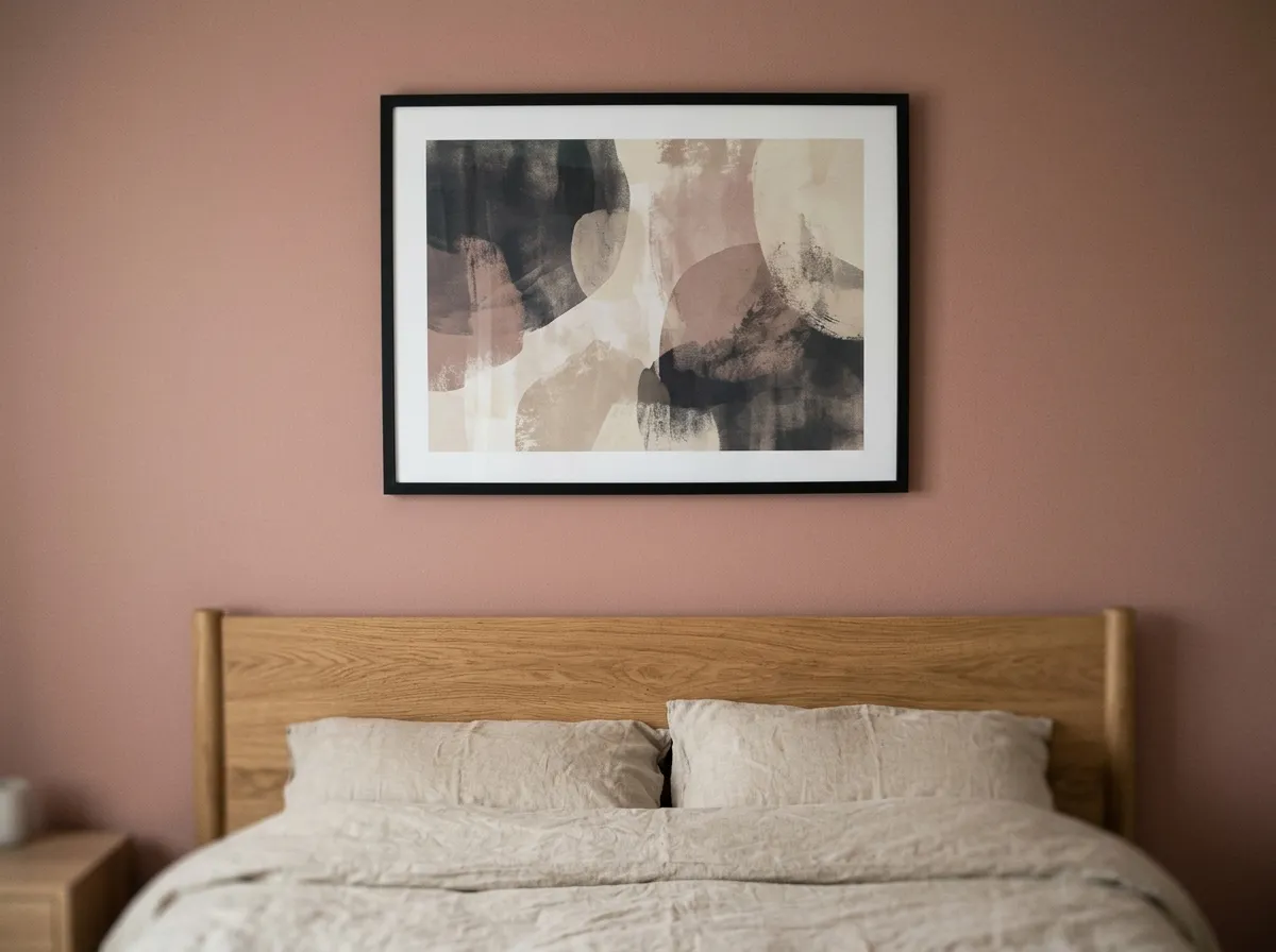
Bedroom wall art ideas require a different standard from living room choices — the room’s primary function is rest, and the art should serve that function rather than compete with it. High-contrast, highly saturated, or compositionally complex wall art raises arousal levels that work against restful sleep. Muted palettes, tonal restraint, and subjects with significant negative space are the choices that genuinely serve a bedroom.
Above the bed is the most important position. The art should span approximately 75–80% of the headboard width and sit 6–10 inches above the headboard top. A 64-inch king headboard calls for art roughly 48–52 inches wide — as a single large print or a paired diptych.
Wall Art Ideas for the Home Office
Home office wall art ideas are performance decisions as much as aesthetic ones. Research from the University of Exeter found that employees in spaces enriched with art were 15% more productive than those in undecorated environments. The mechanism is Attention Restoration Theory: brief, effortless visual engagement with nature imagery allows directed attention to recover between focused tasks.
The most effective position for home office wall art is not above the monitor but on the wall you face when you look away from the screen — the restorative position. A landscape print at 32–40 inches wide in this position provides genuine cognitive recovery during deliberate breaks.
Wall Art Ideas for the Kitchen and Dining Room
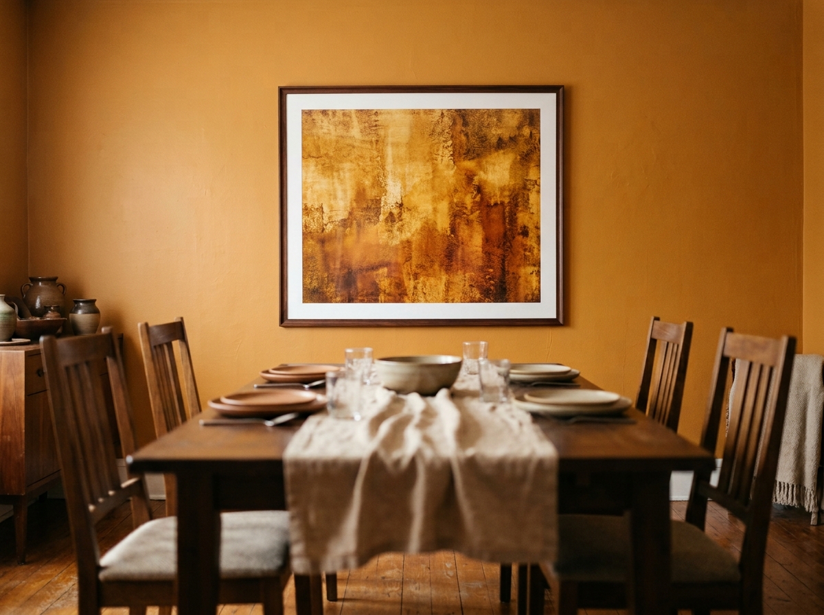
Kitchen and dining room wall art ideas operate in the warmest, most socially active spaces in the home. Warm tones — ochre, terracotta, warm botanical greens, amber — work consistently well here because they reinforce the social and appetitive function of the space. Cool, desaturated wall art in a kitchen or dining room creates a visual disconnection from the warmth of the room’s function.
In kitchens, practical constraints shape which wall art ideas are viable: steam, grease, and temperature variation make paper-based prints less suitable directly beside cooking zones. Prints hung opposite the cooking area, or on dining-side walls with better air circulation, fare significantly better. A triptych of three botanical prints above a kitchen dining table — warm impressionist style, simple white frames — is one of the most reliably successful kitchen wall art ideas.
In dining rooms, scale up more confidently than in other rooms. Dining rooms are rarely viewed from close range — the furniture creates a fixed viewing distance of roughly 6–10 feet. Art that reads correctly at that distance needs to be larger than it appears when evaluated up close: a 40–48 inch piece reads as appropriately scaled above a six-seater dining table; anything smaller reads as a placeholder.
Wall Art Ideas for Hallways and Entryways
Hallway wall art ideas answer to a specific brief that no other room has: the art is experienced in motion. Nobody stops and sits with hallway art the way they do with living room or bedroom art — it is glimpsed, passed, noticed in peripheral vision. This changes what works. Strong silhouettes, clear compositional structure, and prints with legible visual identity at a glance are the wall art ideas that serve hallways well.
For a standard hallway, wall art should never exceed the hallway’s own width. A single 24–32 inch-wide print on the end wall — the wall that terminates the hallway — creates a strong visual stop that makes the hallway feel designed rather than transitional. Alternatively, a series of consistently sized prints along the hallway’s longest wall, hung at consistent height and spacing, creates a rhythm that makes the passage feel intentional.
Entryways specifically benefit from wall art that makes an immediate impression — this is the first art visitors see, and it sets the register for the entire home. A single confident choice at the correct scale does this better than a collection of smaller pieces that require active interpretation. A print at 32 inches or larger reads with immediate presence from a typical doorway viewing distance.
Wall Art Ideas for the Bathroom
Bathroom wall art ideas face the most challenging practical constraints of any room: humidity, temperature variation, and restricted wall space near plumbing fixtures. The practical answer is to place prints on walls that do not receive direct steam or splash — typically the wall opposite the shower or bath rather than adjacent to it — and to use humidity-resistant framing: sealed frames with acrylic rather than glass, and prints on coated paper or canvas rather than standard matte paper.
Subject matter for bathroom prints suits the tonal restraint of a space typically finished in neutral materials. Botanical studies in muted greens and linen tones, monochrome coastal prints, and minimal ink-wash landscapes all read well in bathroom environments. The scale should be smaller than in other rooms: a 16×20 inch print is typically correct for a standard bathroom wall — enough presence to be a considered choice, not so large that it dominates a compact space.
Wall Art Ideas for Commercial and Hospitality Spaces
Commercial wall art ideas — for hotels, restaurants, cafes, Airbnbs, and offices — differ from residential wall art ideas in one fundamental respect: the art must work for the widest range of visitors rather than for the personal taste of a single occupant. This makes neutrality in palette and universality in subject the primary selection criteria, before aesthetic considerations.
For Airbnb and short-term rentals, the most effective choices are muted landscape and nature prints with broad aesthetic appeal and no culturally specific content. A misty coastal print, a monochrome forest study, or a warm botanical composition in neutral tones reads as considered and quality-focused to the widest range of guests.
Restaurant and cafe art needs to work at social distance — typically 6–10 feet from the nearest seated guest — and under artificial lighting conditions that shift through the evening. Large-format, high-contrast prints in warm tones perform best in these settings.
Building a Gallery Wall That Looks Intentional Rather Than Random
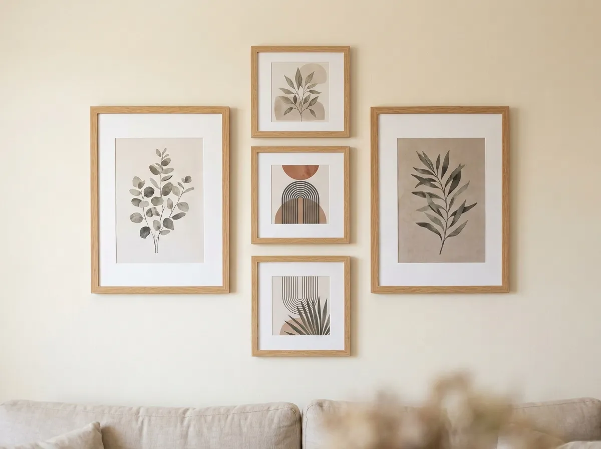
Three rules make the difference between a gallery wall that looks designed and one that looks accumulated. First, find a visual centre for the arrangement and align it at 57 inches from the floor — treat the entire arrangement as one large piece. Second, keep internal spacing consistent: 2–3 inches between all frames. Third, limit the arrangement to two visual variables — either mix sizes but keep a consistent frame finish, or mix frames but keep consistent sizes. Varying both simultaneously creates visual noise.
Lay the arrangement out on the floor before committing to wall holes. Photograph it from standing height, which approximates the wall viewing distance. If it reads as resolved on the floor, it will read as resolved on the wall.
Wall Art Ideas by Technique — the Muted Canvas Eight
Every print at Muted Canvas is built around one of eight specific techniques — visual languages with their own colour palettes, texture systems, and emotional registers. Understanding which technique suits which space is the most precise wall art idea guide available for our collection.
| Technique | Character | Best Rooms | Best Light |
|---|---|---|---|
| Muted Canvas | Dark, cinematic, desaturated. Deep tonal range. | Living room, home office, hallway | South-facing, bright ambient |
| Gilt Edge Canvas | Deep blacks, warm gold accents. Baroque presence. | Dining room, entryway, hotel | Warm artificial, directional |
| Smoke & Ink Wash | Atmospheric, translucent grey. Minimal. | Bedroom, home office, bathroom | Any — reads well in all conditions |
| Impasto Linen | Thick brushwork, tactile grain. Warm and textured. | Living room, dining room, bedroom | Directional — reveals texture beautifully |
| Botanical Meadow | Warm impressionist wildflowers. Romantic and alive. | Kitchen, dining room, bedroom | East-facing, warm morning light |
| Amber Varnish | Warm honey-amber glaze. Antique painting quality. | Dining room, living room, Airbnb | Warm artificial, north-facing rooms |
| Silver Grain Film | High-contrast monochrome with analog grain. | Home office, bathroom, hallway | Cool or neutral — avoids warmth competing |
| Carbon Sketch | Charcoal on paper. Raw, intimate, gestural. | Home office, reading nook, bedroom | Any — grain reads across light conditions |
Recommended Products for Wall Art Ideas in Every Room
Everything you need to source, frame, and hang wall art at the right scale and height, whatever room you’re furnishing.
Frequently Asked Questions
Wall Art Ideas: Where to Start
The most useful starting point for any wall art decision is a room assessment rather than an art search. Write down the room’s primary function, its light direction, and its dominant colour temperature. Measure the wall or furniture span the art needs to address. Only then look at specific prints.
Most failures in choosing wall art happen because the process runs in the opposite direction — a piece is found and loved, and then it either fits the room or it doesn’t. Working from room requirements to print selection makes failures significantly less likely, and makes the eventual choice feel inevitable rather than compromised.
Browse All Eight Techniques →