Muted canvas art for moody interiors is one of the most specific and most satisfying art choices available — when you get it right. Dark, tonal, atmospherically deep art belongs to a particular kind of room: one that prioritises feeling over brightness and depth over openness. This guide covers 12 styles across every moody interior context, with technique, scale, and placement guidance for each.
The 2026 1stDibs Interior Designer Trends Survey of 468 design professionals found maximalism (39%) and eclecticism (38%) are the most requested design aesthetics, both sharing the moody interior’s preference for depth, layering, and tonal richness over bright neutrality. Deep, moody hues have continued their rise, with chocolate brown cited by 33% of designers as the top trending colour — a share that has nearly doubled since 2022.
This balance — darkness without heaviness, atmosphere without oppression — is exactly what muted canvas art provides. Muted tones often carry more depth than bright ones, with subtle undertones that shift under different light and add emotion and atmosphere without overwhelming a space. Dark-toned, desaturated, cinematically composed prints belong to moody interiors the way pale botanical illustrations belong to Scandinavian minimalism: not as decorating decisions, but as the visual language of the space itself.
Muted Canvas Art for Moody Interiors: What Makes It Work
Moody interiors fail for one consistent reason: the darkness is applied to the walls and furniture without corresponding depth in the art. A dark room with pale, bright, or flat art creates visual incoherence — the art floats against the dark background without belonging to it. Designers describe muted tones as acting like a versatile backdrop for wall art rather than an in-your-face statement, which is exactly the quality that lets muted canvas art work in moody interiors: it shares the room’s tonal logic — deep field, warm mid-tones, restrained contrast, and cinematic desaturation.
The mechanism is tonal belonging. In a dark room, the eye needs somewhere to land — a strong focal point is what prevents a moody space from feeling undirected or heavy. Muted canvas art with dark backgrounds and warm, luminous subjects — a lit wildlife study against deep shadow, a moonlit landscape in near-black tonal range — provides exactly this. The art becomes a window of contained warmth within the room’s darkness, rather than a competing bright element that reads as misplaced.
The second mechanism is scale. In a dark room, undersized art disappears. A single large muted canvas print — at least 24 inches wide, ideally the full 24×36 inch single-panel maximum — holds its visual identity against a dark wall in a way that smaller prints cannot.
Cinematic Wildlife — the Signature Muted Canvas Art Style
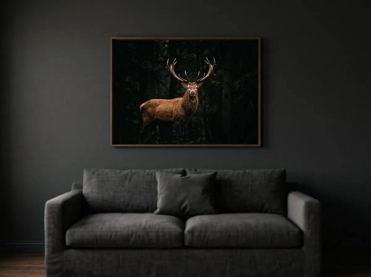
The defining muted canvas art style for moody interiors is cinematic wildlife: a single animal subject — a stag, a heron, a wolf, an eagle — rendered in deep shadow with warm, luminous highlighting that pulls the subject from a near-black background. Its dark field provides visual compatibility with dark walls, while the luminous subject creates the focal point that dark rooms need without introducing tonal conflict.
The cinematic quality comes from the lighting logic. Wildlife in this technique is not photographically lit — it is painted with the same tonal logic as a chiaroscuro portrait: deep shadow defining the edges, warm reflected light carving the form. This quality reads as inherently rich and considered, communicating a standard of artistic decision-making that purely photographic art doesn’t achieve.
For placement, cinematic wildlife works best on the room’s primary focal wall — the wall the main seating faces, or the wall visible from the entrance. A 24–36 inch wildlife study on a deep charcoal or forest-green wall, with a warm directional spotlight aimed at the print, creates the defining visual element of a moody living room.
Dark Landscape Muted Canvas Art for Dramatic Living Rooms
The second major muted canvas art style for moody interiors is the dark landscape: a wide, atmospheric scene — a mountain range at dusk, a forest in deep mist, an open moorland under an overcast sky — rendered in a desaturated tonal range. Where cinematic wildlife provides a focal subject, dark landscape muted canvas art provides spatial depth — the sense of a scene extending beyond the frame.
This spatial depth quality is particularly valuable in living rooms because it creates a perceptual expansion of the space. In a dark living room with deep-toned walls and heavy textiles, a wide dark landscape print performs this expansion function while remaining tonally consistent with the room’s darkness.
Scale is critical. A landscape at 20 inches wide reads as a window; at 30 inches it reads as a portal; at the full 36-inch single-panel maximum it reads as a spatial extension of the room itself. For a wall wider than one panel can convincingly cover, a same-technique triptych extends the effect without exceeding the full-quality ceiling on any single print.
Gilt Edge Muted Canvas Art for Dark Maximalist Interiors
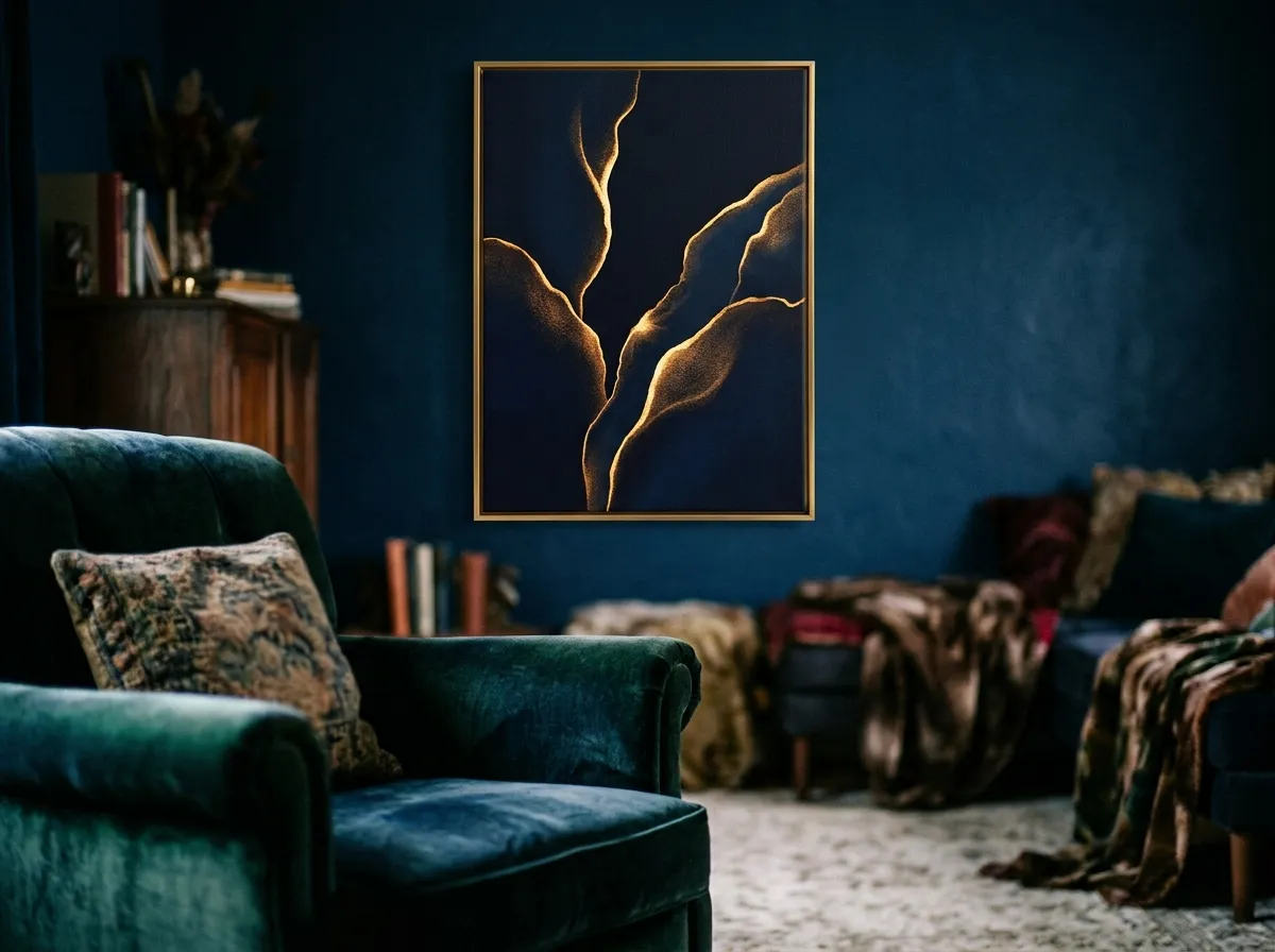
For moody interiors that lean into the maximalist direction — layered textiles, rich colour, vintage pieces, jewel-toned furnishings — the Gilt Edge Canvas technique provides muted canvas art for moody interiors that matches the room’s level of visual ambition. Deep midnight-black backgrounds with warm gold-accented subject edges create a richness that flat or purely desaturated art cannot provide in a maximalist context.
The gold accent quality is specifically valuable because it responds to the warm artificial lighting these rooms typically use. The gold-accented edges catch directional light in a way that creates subtle visual animation across the course of an evening, shifting in character as ambient light changes.
Smoke & Ink Wash — Muted Canvas Art for Refined Dark Interiors
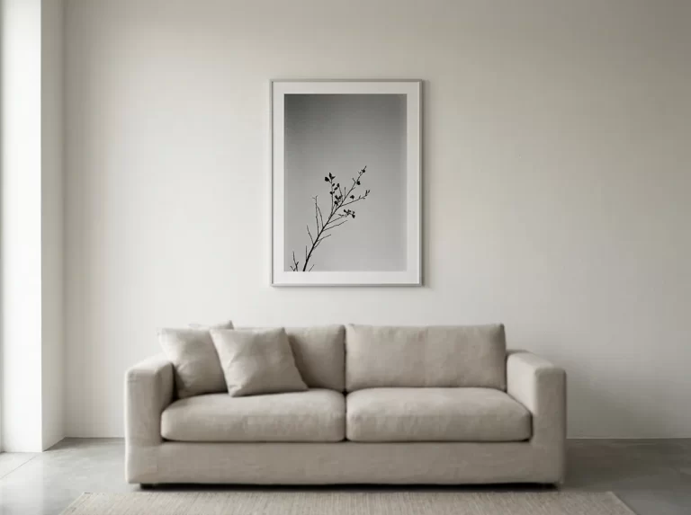
The Smoke & Ink Wash technique produces the most restrained muted canvas art for moody interiors — atmospheric, translucent, and deeply calm. A misty forest study in near-monochrome grey wash is as atmospheric as a dark wildlife print, but in a different emotional register — one that suits the refined dark interior rather than the dramatic one.
This technique belongs most naturally to moody interiors with dark walls in cool tones — deep navy, dark forest green, charcoal grey — where the cool tonal quality of the ink wash reads as harmonious rather than warm and contrasting. On a warm chocolate-brown or burgundy wall, it can read as too restrained; on a cool dark wall, it reads as the room’s most considered element.
Carbon Sketch — Muted Canvas Art for Intimate Moody Spaces
Carbon Sketch charcoal prints — smudged shadow, raw paper grain, the intimate quality of a drawing made in concentrated attention — are among the most personal muted canvas art for moody interiors, belonging to the smaller, more private spaces: reading corners, bedroom alcoves, dark home offices, powder rooms. The intimacy of the medium suits spaces where the viewing distance is short and the experience of the art is close rather than architectural.
In a room already rich with texture — nubby weave, aged leather, deep-pile rug, velvet upholstery — a charcoal study with visible paper grain and smudged edges adds a different kind of texture: the texture of mark-making, a quality increasingly valued as a signal of genuine craft.
Portrait-format Carbon Sketch prints — 16×20 or 20×28 inches — work particularly well in moody interior alcoves and recesses where a tall, narrow surface is available.
Muted Canvas Art for Dark Bedroom Walls — the Moody Sanctuary
Muted canvas art for moody interiors in a dark bedroom serves a different function from living room or dining room choices. The bedroom’s primary function is rest, and the art should support that function even within the moody aesthetic. This means choosing prints that are atmospheric and tonally deep without being agitating — dark landscapes with long tonal gradients and significant negative space, rather than high-contrast dramatic wildlife studies that command attention rather than releasing it.
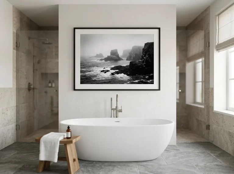
Silver Grain Film muted canvas art — deep tonal monochrome with long warm gradients and analog grain — is the most suitable technique for dark bedrooms. The cool-grey quality reads as calming rather than stimulating under warm artificial light, and the analog grain introduces tactile warmth that pure digital monochrome lacks. A 24–32 inch Silver Grain Film landscape above a dark-linen headboard creates the definitive moody bedroom composition.
Atmospheric Muted Canvas Art for Dark Dining Rooms
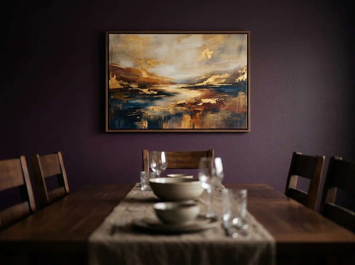
Dark dining rooms — walls in deep aubergine, forest green, midnight navy, or chocolate brown — are the context that most obviously demands muted canvas art for moody interiors. A pale or bright print on a dark dining room wall reads as an error. Muted canvas art in the deep tonal range — specifically Gilt Edge Canvas or rich Muted Canvas prints at substantial scale — reads as the room’s culminating design decision.
The dining room is where muted canvas art under warm artificial light performs most dramatically. Warm pendant lighting at table height creates exactly the directional warm light under which dark-field muted canvas art comes alive — gold accents catch the light, deep tonal landscapes acquire warmth and depth.
Muted Canvas Art for Dark Home Libraries and Studies
The home library and study are the spaces most historically associated with dark, atmospheric interiors — dark wood, deep leather, floor-to-ceiling shelving, heavy textiles. Muted canvas art for moody interiors here must work alongside — not against — the existing visual complexity of books and furnishings. The best choice is a single, strong print in a defined position: above the desk at seated eye level, or on the wall opposite the primary seating.
Avoid large-format wildlife or landscape muted canvas art in a densely furnished library — the scale competition between a large print and a full wall of books creates visual conflict. Medium-format prints (20–32 inches) that read as one considered element among the library’s many elements work better here.
Scale and Placement of Muted Canvas Art in Dark Rooms
Dark rooms change the visual dynamics of scale for muted canvas art for moody interiors. In a pale-walled room, a print creates contrast with its background — the frame and print stand out. In a dark-walled room, a print must hold its visual identity against a background that absorbs rather than reflects it. This requires larger scale than the same print would need in a bright room.
The general rule is to size up by approximately 20% compared to the same wall in a light-toned room. A position that would call for a 20-inch print in a white-walled room calls for a 24-inch print in a dark-walled room. The dark background reduces the effective visual size of any print hung against it — not its physical dimensions, but its visual weight relative to the room.
Hanging height follows the standard 57-inch rule for standalone walls, but in dark rooms with low ambient lighting, consider dropping the height slightly — to around 51–53 inches — to keep the art within the zone of primary artificial lighting rather than the upper wall where evening ambient light is typically weaker.
Lighting Muted Canvas Art in Moody Interiors — the Most Important Variable
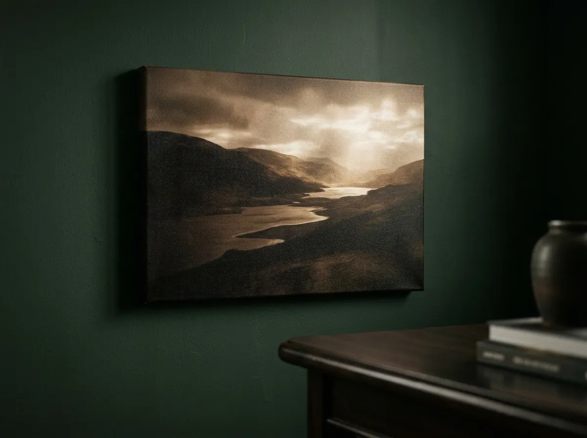
Muted canvas art in moody interiors is transformed by dedicated lighting in a way that art in bright rooms is not. In a room with abundant natural light, art is seen under conditions close to those in which it was chosen. In a dark room with low ambient lighting, art without dedicated lighting can disappear entirely — reading as a dark rectangle on a dark wall rather than a tonal composition with depth and warmth.
A dedicated picture light or directional spot aimed at the muted canvas art provides a point of warm light the eye returns to throughout the room experience. A narrow-beam warm white spotlight (2700K, 15–25° beam angle) is the optimal approach — raking directional light reveals tonal depth in ways flat ambient light cannot. Without it, the darkest portions of a dark-field print merge with a dark wall, losing the composition’s entire tonal logic.
Muted Canvas Art for Moody Interiors — By Room and Palette
The table below maps common moody interior contexts to the most effective muted canvas art for moody interiors — techniques, sizes, and placement approaches for each.
| Dark Room Context | Best Technique | Size | Key Placement |
|---|---|---|---|
| Dark living room (moody maximalist) | Gilt Edge Canvas or Muted Canvas wildlife | 24×36″ — size up 20% for dark walls | Feature wall, sofa-facing, well lit |
| Dark living room (refined minimal) | Smoke & Ink Wash or Silver Grain Film | 20–30″, one piece, generous empty space | Single primary wall, no competing pieces |
| Dark bedroom (cocooning) | Silver Grain Film or Muted Canvas landscape | 24–32″ above headboard | Above bed, warm tonal undertones |
| Dark dining room | Gilt Edge Canvas or Muted Canvas | 24×36″ on end wall | Wall facing diners |
| Home library / study | Carbon Sketch or Smoke & Ink Wash | 20–32″, medium format | Above desk at seated eye level |
| Dark hallway or entryway | Muted Canvas wildlife or Silver Grain Film | 24–36″ on end wall | Terminating wall, visible from entrance |
| Cocktail bar or wine cellar | Gilt Edge Canvas or Carbon Sketch | 24–32″, drama at close range | Back wall or alcoves |
| Dark bathroom / powder room | Silver Grain Film or Carbon Sketch | 16–20″, considered detail | Opposite shower, sealed acrylic frame |
Recommended Products for Muted Canvas Art in Moody Interiors
Everything you need to source, frame, light, and hang muted canvas art for moody interiors at the right scale for a dark, atmospheric room.
Frequently Asked Questions
Muted Canvas Art That Belongs to the Room
The moody interior is one of the most specific and most rewarding contexts for muted canvas art for moody interiors, precisely because the requirements are precise. Not any art in a dark room. Not simply dark art in a dark room. It must share the room’s tonal logic, belong to its warmth, and provide the focal depth that dark rooms need to feel resolved rather than merely dim.
Start with the room’s primary focal wall. Get the scale, technique, and lighting right there, and the rest of the room follows the same logic.
Browse Muted Canvas Art →