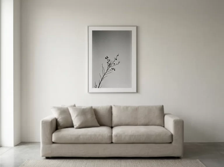
Ink wash wall art brings a stillness to a room that few other styles manage. Soft, translucent greys, deliberate negative space, and a sense that the composition was arrived at rather than assembled — this is art that quiets a room instead of filling it. This guide covers 11 proven rules for where ink wash wall art works, how to style it respectfully, and how to place it so its restraint reads as intentional rather than empty.
Ink wash wall art draws its visual language from centuries of East Asian ink painting traditions, where a single wash of diluted ink could suggest a mountain, a mist, or a bare branch through tone and restraint rather than detail. Contemporary interpretations — like MutedCanvas’s Smoke & Ink Wash technique — borrow that tonal sensibility for modern interiors, without claiming to reproduce any specific historical school or artist’s work.
This guide walks through ink wash wall art room by room, the difference between genuine wash painting technique and imitation, and how to place it so the negative space reads as considered rather than incomplete.
Ink Wash Wall Art for Living Rooms
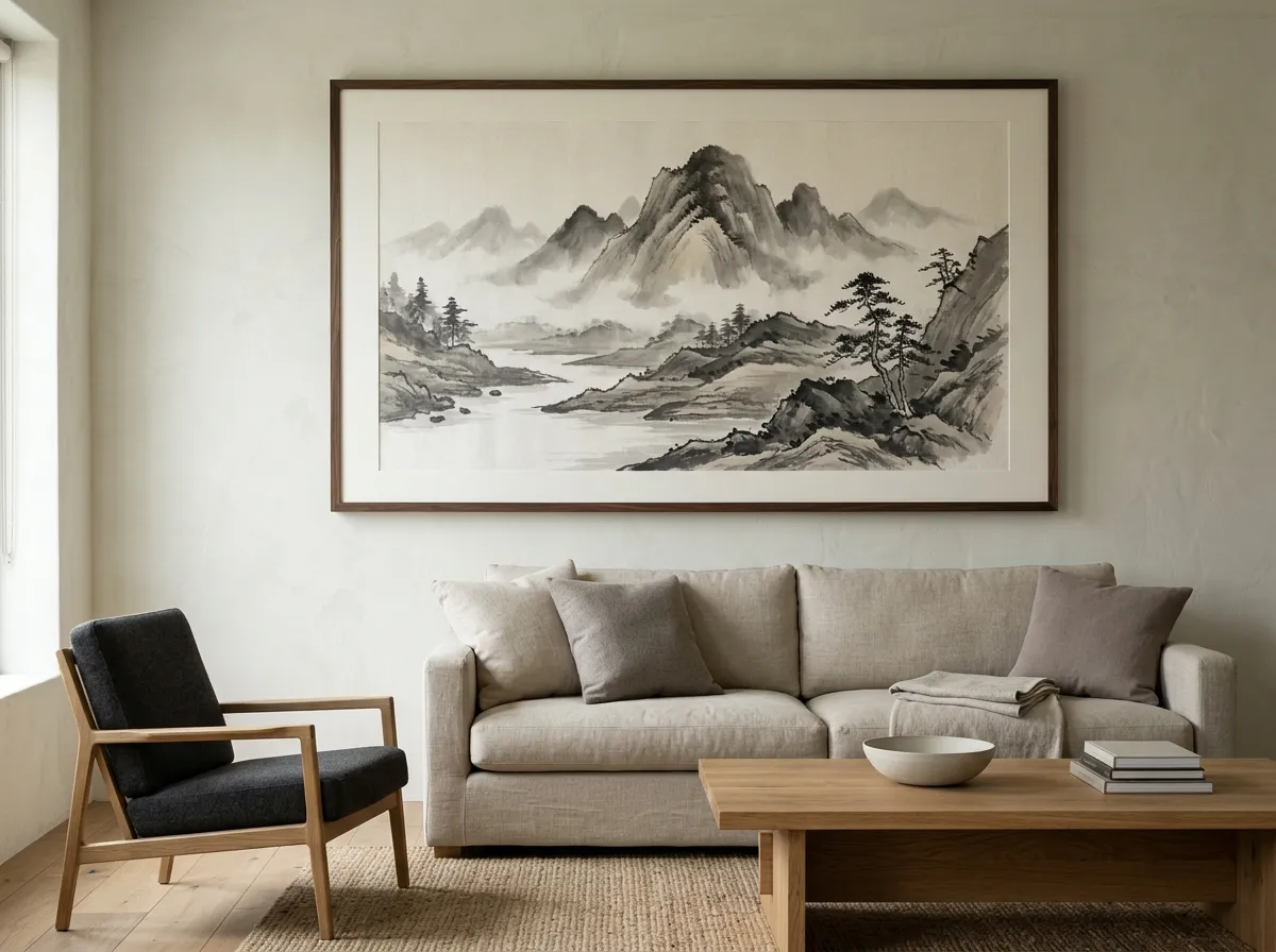
The living room is a natural fit for ink wash wall art, provided the rest of the room has enough restraint to let its subtlety register. A soft, atmospheric piece above a sofa gives the room a quiet focal point without introducing colour or busyness that competes with the rest of the space.
Because ink wash wall art depends so heavily on negative space to create its effect, it works best where the surrounding wall isn’t crowded with other decor — a single well-placed piece, given genuine breathing room, typically outperforms a fuller gallery-style arrangement.
Ink Wash Wall Art for Bedrooms
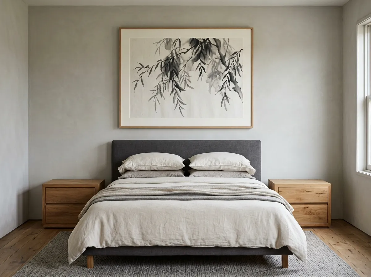
Bedrooms are arguably the single best-suited room in the home for ink wash wall art, since the entire brief of a bedroom — rest, quiet, low visual stimulation before sleep — aligns directly with what the style is built to deliver. A soft grey wash piece above the headboard gives the room a calm focal point without introducing colour or detail that competes with actual rest.
Sized to 75–80% of the headboard’s width, ink wash wall art in a bedroom should generally lean toward the softer, more diffuse end of the technique’s range rather than higher-contrast compositions, which read as more active and less suited to a room meant for winding down.
Ink Wash Wall Art for Meditation and Wellness Spaces
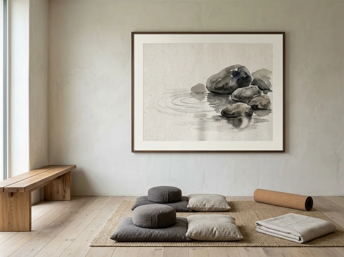
For a dedicated meditation corner, yoga space, or home wellness room, ink wash wall art is close to a natural default rather than one option among many — the entire premise of the style is a composition that supports quiet attention rather than demanding it.
These spaces benefit from the softest end of the ink wash wall art range — pieces where the composition nearly dissolves into its own negative space. Scale matters differently here too: a modest 16–24 inch piece, viewed from close range during seated practice, can have as much presence as a much larger piece viewed from across a living room.
Ink Wash Wall Art for Bathrooms and Spa-Style Spaces
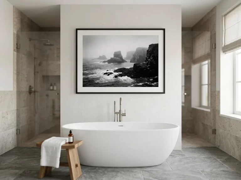
Bathrooms styled for a spa-like quality are another strong fit for ink wash wall art — the soft, misty tonal quality of the technique echoes the steam and water already associated with the room, without resorting to literal water imagery, which can feel on-the-nose in this context.
For bathrooms, choose prints and framing rated for higher humidity, or position ink wash wall art away from direct shower spray. Ink wash wall art pairs particularly well with natural stone, matte tile, and other spa-associated materials already common in higher-end bathroom design.
Ink Wash Wall Art for Home Offices and Study Spaces
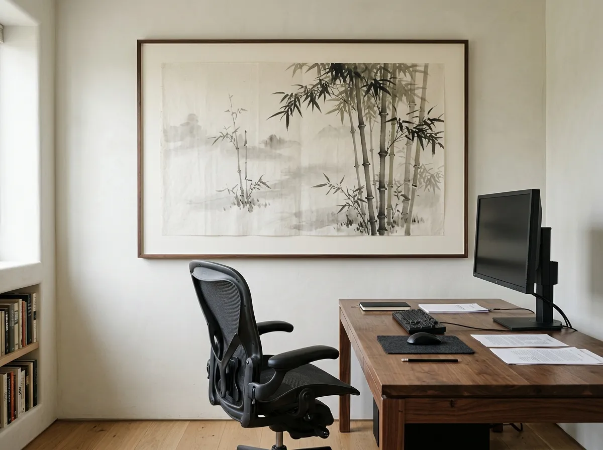
In a home office, ink wash wall art offers something most productivity-focused decor doesn’t: a genuine visual rest point during the day. Positioned within easy sightline of the desk, a soft, atmospheric piece gives the eye somewhere to land during a pause between tasks, without the visual stimulation of a busier print.
For home offices used for video calls, ink wash wall art also photographs well on camera — its soft tonal range rarely clashes with typical laptop camera exposure the way high-contrast or brightly coloured art sometimes can.
Ink Wash Wall Art and Respecting the Tradition
Ink wash painting has a long, specific history across East Asian art traditions — Chinese shan shui landscape painting and Japanese sumi-e both developed the technique of building an entire composition from tonal variation in diluted ink, over many centuries and distinct schools of practice. Asian-inspired wall art that draws on this language should do so with real respect for that depth, rather than treating it as a decorative surface effect divorced from its origins.
For contemporary interior use, this means being honest about what a piece is: a modern interpretation influenced by this tradition’s tonal sensibility, not a reproduction of or replacement for genuine historical or contemporary work from these traditions. MutedCanvas’s Smoke & Ink Wash technique is presented in this spirit — inspired by the atmospheric, restrained quality of ink wash painting, without claiming affiliation with any specific school, artist, or cultural tradition.
What Makes Ink Wash Technique Genuine
The defining quality of wash painting is tonal variation built from diluted pigment rather than line, colour, or texture — value and gradient carry the entire composition. In genuine wash painting, this produces a soft-edged, atmospheric quality where forms seem to emerge from or dissolve into the surrounding space, rather than being sharply outlined against it.
This is a meaningfully different skill from simply reducing colour saturation on a photograph — genuine wash painting technique depends on how the tonal gradient itself is built, which is why some pieces marketed as ink wash wall art read as flat or artificial rather than atmospheric. The gradient needs to feel organic, the way ink actually diffuses through water or paper, rather than a uniform digital fade.
Lighting and Negative Space for Ink Wash Wall Art
Ink wash wall art depends more heavily on its surrounding conditions than almost any other style — the same piece can look quietly luminous under soft, indirect light and comparatively flat under harsh overhead lighting. Diffuse, warm lighting consistently brings out the tonal depth this style depends on.
Negative space is equally important. Because the composition itself relies on empty or near-empty areas to create its sense of atmosphere, crowding the surrounding wall with other decor undermines the effect more than it would for a busier, more detailed style of art.
Which Interior Styles Suit Ink Wash Wall Art
Ink wash wall art fits naturally into several established interior styles, each drawing on the same underlying quality of restraint.
Japandi and wabi-sabi influenced interiors — a near-perfect match, since both prioritise natural materials, negative space, and a quiet, unhurried visual register.
Modern minimalism — ink wash wall art gives a minimalist room warmth and depth without introducing colour or clutter that would undercut the style’s discipline.
Scandinavian interiors — the pale, natural palette common to Scandinavian design provides an ideal backdrop for the soft greys of genuine wash painting technique.
Scale and Placement for Ink Wash Wall Art
Ink wash wall art can work at a wider range of scales than more detailed styles, since its impact depends on tonal quality rather than fine detail that needs to be seen up close. Above a sofa, the standard 60–75% of furniture width applies. Standard files run up to the 24×36 inch full-quality ceiling; a wall that genuinely needs more can use a same-technique triptych rather than an oversized single panel.
Hanging height follows the standard 57-inch centre-height convention for most standalone placements, with the seated-eye-level adjustment noted earlier for meditation and wellness spaces specifically. Because the style depends so heavily on negative space, err toward a single well-placed piece rather than a grouping.
What to Avoid With Ink Wash Wall Art
Crowding the negative space. Surrounding ink wash wall art with additional decor or a cluttered wall undermines the restraint the entire style depends on.
Flat digital gradients passed off as genuine wash technique. A uniform fade lacks the organic tonal variation that makes real wash painting feel atmospheric rather than filtered.
Harsh, direct lighting. Hard overhead spotlights flatten the subtle tonal depth that this style depends on to read as luminous rather than dull.
Treating cultural origin as purely decorative. Asian-inspired wall art should acknowledge the depth of the traditions it draws from rather than presenting itself as disconnected decorative style.
Pairing with visually loud surroundings. Ink wash wall art in a heavily patterned or brightly coloured room gets lost rather than providing the calm counterpoint it’s suited for.
Ink Wash Wall Art by Room — Complete Styling Guide
The table below maps common rooms to sizing, lighting, and placement guidance for ink wash wall art.
| Room | Sizing Approach | Lighting | Placement Note |
|---|---|---|---|
| Living room | 60–75% of sofa width | Diffuse, warm ambient | Generous negative space either side |
| Bedroom | 75–80% of headboard width | Soft, dimmable evening light | Softer, more diffuse compositions |
| Meditation / wellness space | 16–24 inches, close viewing range | Natural or soft indirect light | Seated eye level, ~39–43 inches |
| Bathroom / spa space | 20–31 inches | Warm, humidity-appropriate fixture | Away from direct water contact |
| Home office | 16–24 inches | Even, indirect lighting | Within peripheral desk sightline |
Recommended Products for Ink Wash Wall Art
Everything you need to frame, light, and protect ink wash wall art in the quiet, considered rooms this style is built for.
- Browse our complete Wall Art Ideas guide for every space
- See our Muted Canvas and Moody Interiors guide for a tonally related, cooler-toned technique
- Read our Bedroom Wall Art Ideas guide for more on the room this style suits best
- See our Interior Design Wall Art guide for sourcing calming pieces for spa and wellness client spaces
Frequently Asked Questions
Ink Wash Wall Art That Earns Its Quiet
The rooms where ink wash wall art works best share a consistent quality: enough restraint elsewhere in the space to let the piece’s subtlety actually register, genuine tonal depth rather than a flat digital fade, and soft, diffuse lighting that brings out what the composition is doing rather than flattening it. It’s a style built on doing less, which paradoxically takes more care to get right.
Chosen and placed with that care, ink wash wall art gives a room something increasingly rare. Start with the negative space — protect it first, and the rest of the styling follows from there.
Shop Smoke & Ink Wash Prints →