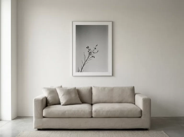
Black and white wall art does something colour photography can’t: it forces composition, light, and shadow to carry the entire image. Stripped of colour, a strong piece reads as more deliberate and more confident than an equivalent scene in full colour. This guide covers 11 proven rules for where black and white wall art works, how to tell genuine film grain from a flat digital filter, and how to style it for maximum editorial impact.
Black and white wall art occupies a distinctive place in interior design — it reads as sophisticated in almost any setting, from a stark minimalist loft to a richly furnished traditional room, because removing colour removes the one variable most likely to clash with a room’s existing palette. Part of what makes this style durable rather than trend-driven is that contemporary interiors — the design language monochrome photography suits best — continue to hold the largest single share of the interior design market by style.
This guide walks through black and white wall art room by room, the difference between genuine film grain and a flat digital filter, and how to pair it with colour and materials elsewhere in a room.
Black and White Wall Art for Bathrooms
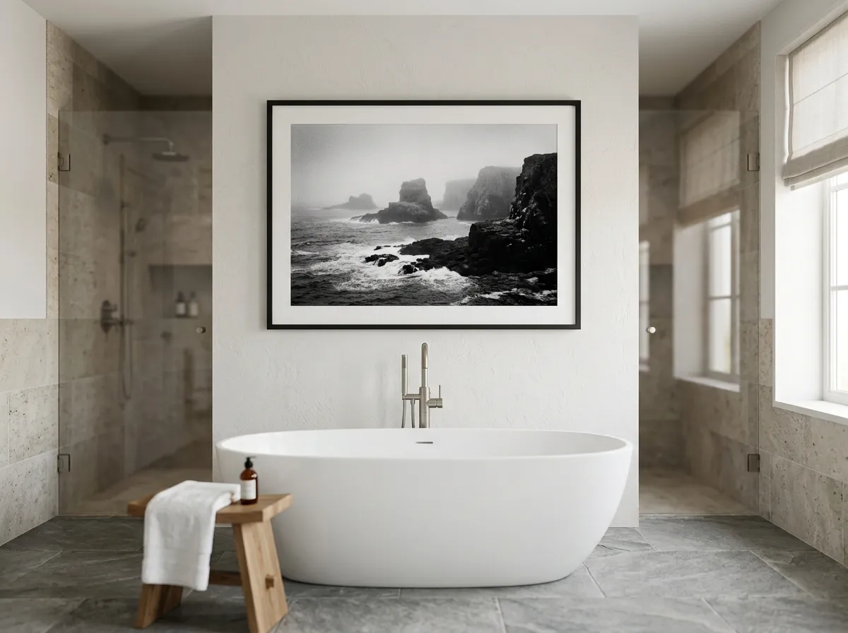
A spa-style bathroom is a strong, underused setting for black and white wall art — its clean tonal range echoes natural stone and matte tile without competing with either, and the style’s colour-neutral quality means it won’t clash with whatever fixture finish the room is built around.
Positioned on a dry feature wall away from direct water contact, a single large piece gives a bathroom the kind of editorial presence usually reserved for living spaces, without requiring a full renovation to achieve.
Black and White Wall Art for Dining Rooms
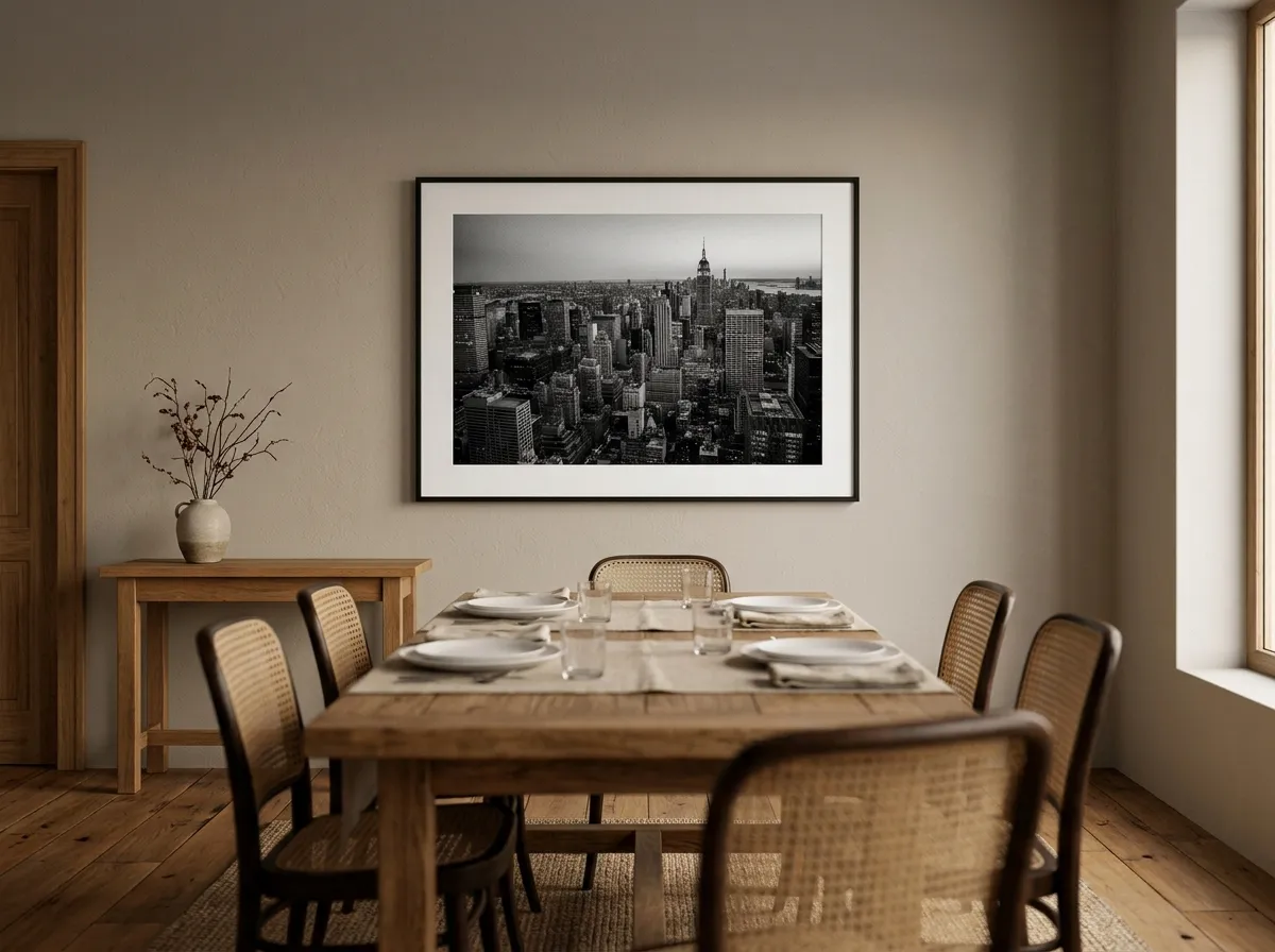
A dining room benefits from black and white wall art in a specific way: its editorial, confident register suits a room built for entertaining, and its colour-neutral quality means it won’t clash with whatever tableware, linens, or seasonal decor rotate through the space over time.
A single large piece facing seated diners gives the room genuine visual authority, and because the style doesn’t depend on directional light to register the way a textured piece does, it holds up consistently whether the room is lit for a bright lunch or a dim dinner party.
Black and White Wall Art for Children’s Rooms
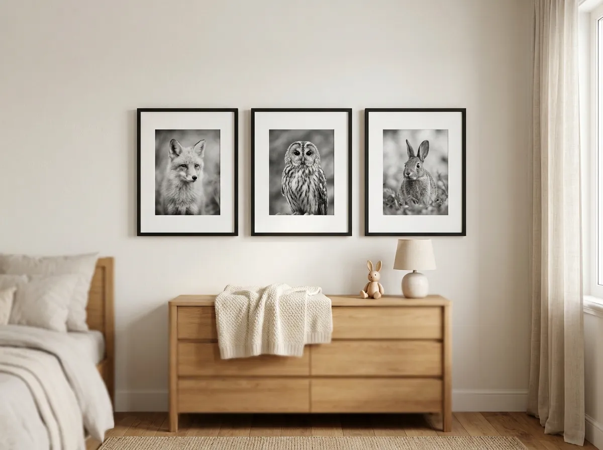
Gentle black and white animal photography is a durable choice for a children’s room — a soft-toned portrait reads as calming rather than overstimulating, and the style ages well with the child in a way brightly coloured, character-driven decor often doesn’t.
A small set of two or three related photographs, evenly spaced and identically framed, gives a children’s room a considered collection rather than a single isolated piece, and the neutral palette makes it easy to update surrounding colour accents as the child’s taste changes over time.
Black and White Wall Art for Studios and Creative Spaces
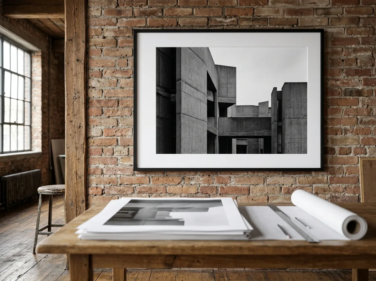
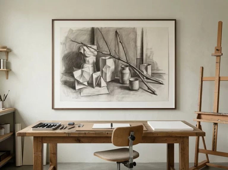
Studios and creative workspaces suit black and white wall art’s editorial, documentary quality especially well — the style’s analog, film-grain texture complements raw materials like exposed brick and concrete far more naturally than a glossy, saturated print would.
Because a studio is often a working space rather than a purely decorative one, a bolder, higher-contrast piece tends to suit the room’s energy better than a softer, more muted composition, giving the space real visual authority without requiring colour.
Monochrome Art — Beyond Black and White
Monochrome art, strictly defined, refers to any single-tone palette — not exclusively black and white, but also sepia, deep blue, or any other single hue explored across its full tonal range. Black and white is the most common and most versatile expression of monochrome art, but understanding the broader category helps in choosing intentionally rather than defaulting to black and white by habit.
For rooms with a specific existing colour story, monochrome art in a matching single hue — a deep charcoal-blue tone, for instance — can integrate even more seamlessly than strict black and white, while still carrying the same compositional discipline that defines the category. MutedCanvas’s Silver Grain Film technique focuses specifically on black and white, but the broader logic of monochrome art applies across the wider category for anyone considering a single-hue alternative.
Film Grain Wall Art — Genuine Texture vs. Filter
Film grain wall art draws on the specific, organic texture created by actual analog film — a fine, irregular pattern produced by light-sensitive silver halide crystals, quite distinct from the uniform noise a digital filter adds to simulate the same effect. Genuine film grain has natural variation in size and density across an image; digital noise filters tend to apply a uniform pattern evenly throughout.
This distinction matters for how convincingly film grain wall art holds up under close inspection. A piece with real analog grain reveals organic, irregular texture the closer you look; a piece with an applied digital filter tends to look identical at any zoom level, which is a reliable tell for evaluating quality. Beyond the technical distinction, genuine film grain carries a specific emotional register — a sense of a moment actually captured on physical film, rather than a purely digital composition dressed up to look analog.
Black and White Wall Art in Commercial Spaces
Commercial spaces — reception areas, coworking floors, boutique hotel corridors — benefit from black and white wall art for the same reasons residential rooms do, plus one additional advantage: its colour-neutral quality means it won’t clash with a brand’s specific colour palette used elsewhere in signage or furnishings.
For hospitality and retail settings especially, a consistent black and white wall art programme across a property reads as a considered brand decision rather than incidental decor, which is a large part of why this style shows up so often in boutique hotels and design-forward retail environments. Because it carries less colour risk than other styles, it’s often one of the fastest specifications to get client sign-off on.
Pairing Black and White Wall Art With Colour
Because black and white wall art introduces no colour of its own, it pairs successfully with almost any existing palette — warm or cool, bold or neutral. This is arguably its single biggest practical advantage over more colour-specific styles that require careful palette matching.
In a room built around a bold or saturated colour scheme, black and white wall art can serve as a deliberate visual break, giving the eye a moment of calm within an otherwise vibrant space. Frame choice matters more here than colour matching — a black frame reinforces the high-contrast mood, while a natural wood or white frame softens it slightly without altering the image itself.
Which Interior Styles Suit Black and White Wall Art
Black and white wall art works across an unusually broad range of interior styles, since removing colour removes the primary source of potential clash with any given room.
Modern and contemporary — a near-default choice, and the style segment currently holding the largest share of the interior design market overall.
Scandinavian and minimalist — the clean, high-contrast register suits these styles’ emphasis on clarity and restraint.
Industrial — film grain wall art’s analog, documentary quality complements raw materials and exposed structural elements particularly well.
Traditional and eclectic — a single black and white piece can introduce contrast and calm into an otherwise richly coloured or patterned room without disrupting its character, remaining a natural counterpoint even as maximalism holds ground as the top-requested style for 2026.
Scale and Placement for Black and White Wall Art
Black and white wall art follows the same general sizing formulas as other styles — 60–75% of sofa width above a living room seating area, 75–80% of headboard width in a bedroom — with its high contrast making correctly judged scale especially important, since an undersized piece loses visual impact quickly given how much of its effect depends on presence. Standard files run up to the 24×36 inch full-quality ceiling; a same-technique triptych suits a wall that needs more.
Hanging height follows the standard 57-inch centre-height convention for most standalone placements. Lighting is comparatively forgiving for black and white wall art compared with more texture- or colour-dependent styles — even, ambient lighting reads well, since the piece’s impact comes primarily from tonal contrast rather than requiring specific directional light to register.
What to Avoid With Black and White Wall Art
Washed-out tonal range. Black and white wall art without genuine range from deep black to bright white reads as flat and unremarkable rather than confident and high-contrast.
Digital noise filters passed off as film grain. A uniform grain pattern applied evenly across an image lacks the organic irregularity of genuine analog texture, and tends to look artificial on close inspection.
Inconsistent framing in a series. A multi-piece grouping with mismatched frames or uneven spacing undermines the curated, gallery-wall effect that makes this placement so effective.
Undersizing. Because impact depends heavily on presence and contrast, black and white wall art that’s too small for its wall loses much of its visual authority.
Overusing it throughout an entire home. While flexible, black and white wall art in every single room can start to feel like a default rather than a deliberate choice — reserve it for the spaces where it genuinely earns its place.
Black and White Wall Art by Room — Complete Styling Guide
The table below maps common rooms to sizing, contrast level, and placement guidance for black and white wall art.
| Room | Sizing Approach | Contrast Level | Placement Note |
|---|---|---|---|
| Bathroom | Medium to large, up to 24×36″ | Full range, confident | Dry wall, away from shower spray |
| Dining room | Large statement piece | Full range, confident | Wall facing seated diners |
| Children’s room | Small, set of two or three | Gentle, softer tonal range | Evenly spaced, identical framing |
| Studio / creative space | Large, bold composition | High contrast, confident | Pairs with raw, industrial materials |
Recommended Products for Black and White Wall Art
Everything you need to frame, light, and display black and white wall art so its tonal range and grain actually read.
- Browse our complete Wall Art Ideas guide for every space
- See our Muted Canvas and Moody Interiors guide for a tonally related, warmer technique
- Read our Hotel Wall Art guide for hospitality-specific placement guidance
- See our Interior Design Wall Art guide for presenting low-risk, colour-neutral pieces in client proposals
Frequently Asked Questions
Black and White Wall Art That Earns Its Confidence
The rooms where black and white wall art works best share a consistent pattern: genuine tonal range from deep black to bright white, real film grain rather than a flat digital filter where texture matters, and correct scale to carry the visual authority the style depends on. It’s a category built on discipline — composition and contrast doing the work colour would otherwise do.
Done well, it’s one of the most reliably confident choices available in wall art, and one of the few that genuinely suits almost any room it’s placed in. Start with tonal range — get real black-to-white contrast, and correct scale, and the rest of the room adjusts around it.
Shop Silver Grain Film Prints →