Minimalist wall art asks more of a room than it looks like it does. A single restrained piece with generous negative space around it has to earn its place through composition and placement alone, without the volume or colour a busier style can lean on. This guide covers 11 proven rules for minimalist wall art — what actually reads as considered restraint rather than an empty wall, and how to choose, scale, and place it so it does real work in a room.
Minimalist wall art isn’t a single look so much as a discipline: fewer pieces, more negative space, and a tolerance for a wall that isn’t fully “filled.” That discipline is genuinely hard to get right, which is exactly why a well-placed minimalist piece reads as confident rather than accidental — it signals that the empty space around it was a decision, not an oversight.
This guide walks through minimalist wall art room by room, which MutedCanvas techniques read as genuinely minimalist rather than just sparse, and the scale and placement rules that separate a considered minimalist wall from an unfinished one.
Minimalist Wall Art for Living Rooms
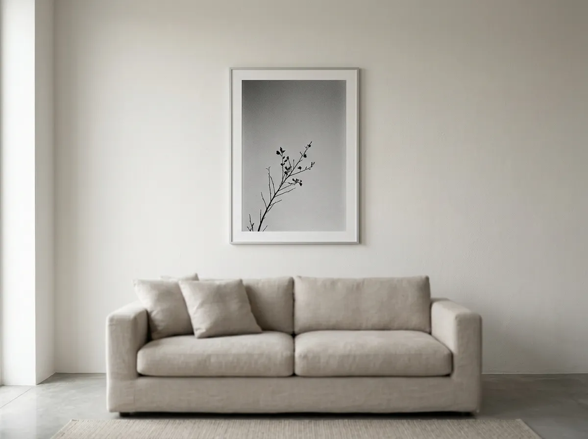
A living room is the room where minimalist wall art’s restraint is most visible, since it’s usually the largest wall and the one most tempting to fill. A single correctly scaled piece, with real negative space left around it, does more for the room than a fuller arrangement would — the empty wall becomes part of the composition rather than a gap to close.
Minimalist wall art in a living room works best when it’s chosen as the room’s one clear focal point rather than competing with other statement furniture or decor. If the sofa, a rug, or a lighting fixture is already doing visual work, the art should generally recede rather than add another competing element.
Negative Space — the Core Principle of Minimalist Wall Art
Negative space isn’t empty space that happens to surround a piece — for minimalist wall art specifically, it’s an active part of the composition. A wall with generous, deliberate space around a single piece reads as considered in a way a wall packed edge-to-edge with decor doesn’t, regardless of how good any individual item is.
The general guide is to leave at least as much clear wall space around a minimalist piece as the piece itself occupies, and often more. This is a meaningfully different ratio than a maximalist or gallery-style arrangement, where filled wall space is the point rather than something to avoid.
Which Technique Reads as Genuinely Minimal
Several MutedCanvas techniques suit minimalist wall art particularly well, largely because they already build restraint into the composition itself rather than relying on styling to create it.
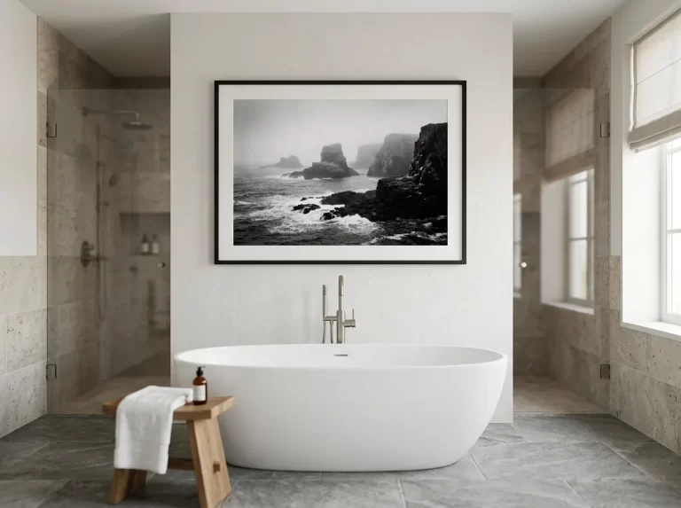
Silver Grain Film — high-contrast monochrome with a naturally sparse, editorial quality that suits minimalist interiors especially well.
Smoke & Ink Wash — atmospheric, tonally restrained compositions built around negative space from the outset.
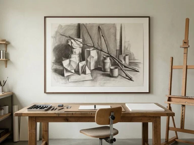
Carbon Sketch — fine, economical linework that carries presence through restraint rather than density.
Muted Canvas — desaturated, cinematic tones that read as quiet and considered rather than busy.
Minimalist Wall Art for Bedrooms
 5% · target under 150KB
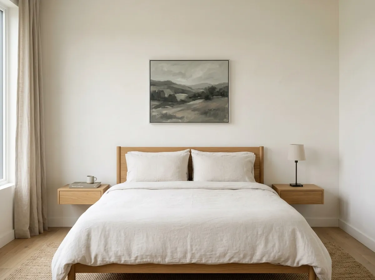
A bedroom is one of the most natural fits for minimalist wall art, since the room’s entire purpose — rest, calm, low visual stimulation — aligns directly with what the style is built to deliver. A single modest piece above the headboard, rather than the fuller 75–80% width formula used in busier styles, keeps the room feeling genuinely restful.
Minimalist wall art in a bedroom pairs naturally with equally restrained bedding and nightstand styling — the art shouldn’t be the only minimal element in an otherwise cluttered room, or the restraint reads as inconsistent rather than intentional.
Single Piece vs. Gallery Wall for Minimalist Interiors
A single piece is the default choice for minimalist wall art, but a gallery wall isn’t automatically ruled out — it simply needs to follow the same restraint principle at a different scale. A minimalist gallery wall uses fewer pieces, more consistent framing, and considerably more spacing between each piece than a maximalist or eclectic grouping would.
Where a single piece doesn’t suit the wall’s proportions, two or three pieces in a strict grid, evenly spaced and identically framed, can maintain minimalist discipline better than one oversized piece forced to fit an awkward space.
Colour and Tonal Restraint in Minimalist Wall Art
Minimalist wall art generally works within a limited palette — monochrome, desaturated, or a narrow tonal range — rather than introducing multiple competing colours. This isn’t a hard rule, but colour restraint is one of the most reliable ways to keep a piece reading as minimal rather than simply small.
A single warm or cool undertone, carried consistently through the piece, tends to integrate more successfully into a minimalist room than a multi-colour composition would, even if the multi-colour piece is otherwise well composed.
Minimalist Wall Art for Home Offices
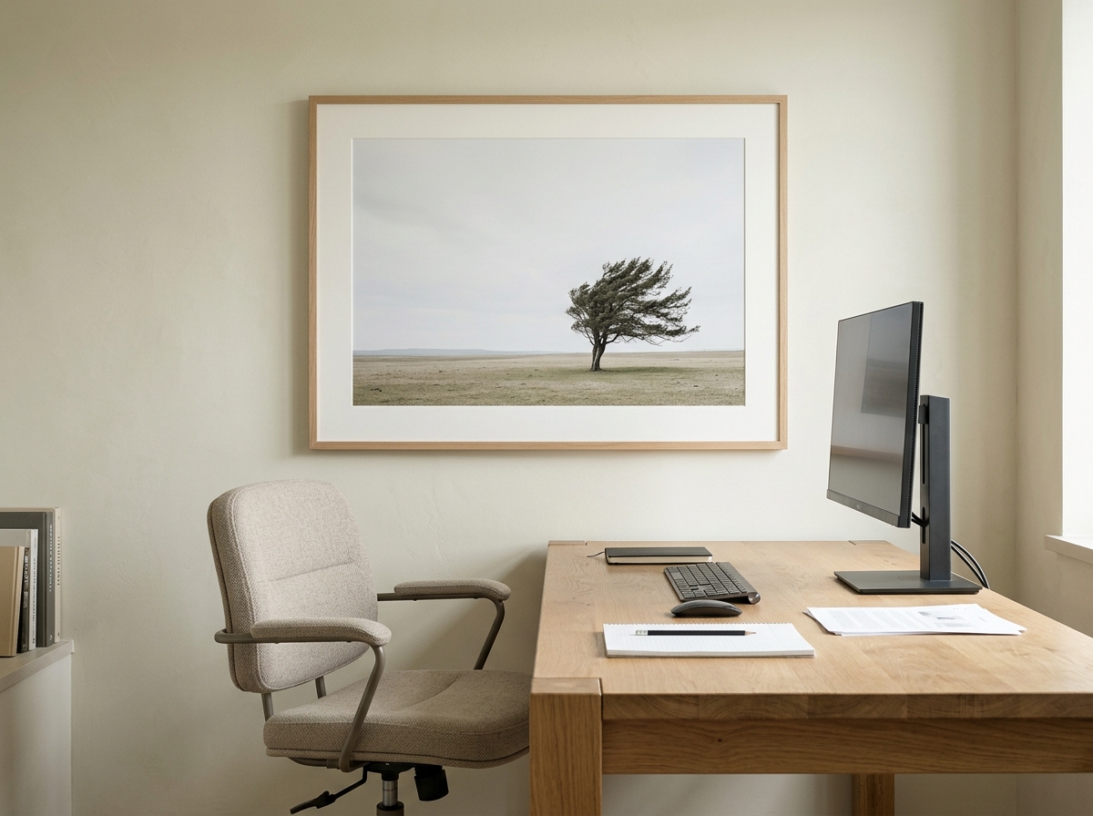
A home office benefits from minimalist wall art in a very practical way: a single, quiet piece gives the eye a genuine rest point during a work day without introducing the visual stimulation of a busier style, which can undercut focus rather than support it.
Minimalist wall art also suits video calls particularly well — a restrained, low-contrast piece rarely fights with typical laptop camera exposure the way a busier or more saturated piece can, and reads as considered background without drawing attention away from the call itself.
Which Interior Styles Pair With Minimalist Wall Art
Minimalist wall art is closely associated with several related but distinct interior styles, each applying restraint slightly differently.
Scandinavian — pale, natural palettes and clean lines provide an ideal neutral backdrop for minimalist wall art’s restraint.
Japandi — blends minimalist restraint with warmer, more tactile natural materials, softening minimalism’s occasionally cold reputation.
Wabi-sabi — embraces minimalist principles alongside visible imperfection and organic irregularity, rather than pursuing flawless uniformity.
Quiet luxury — applies minimalist restraint to higher-end materials and finishes, where the discipline signals considered taste rather than budget constraint.
Minimalist Wall Art for Entryways
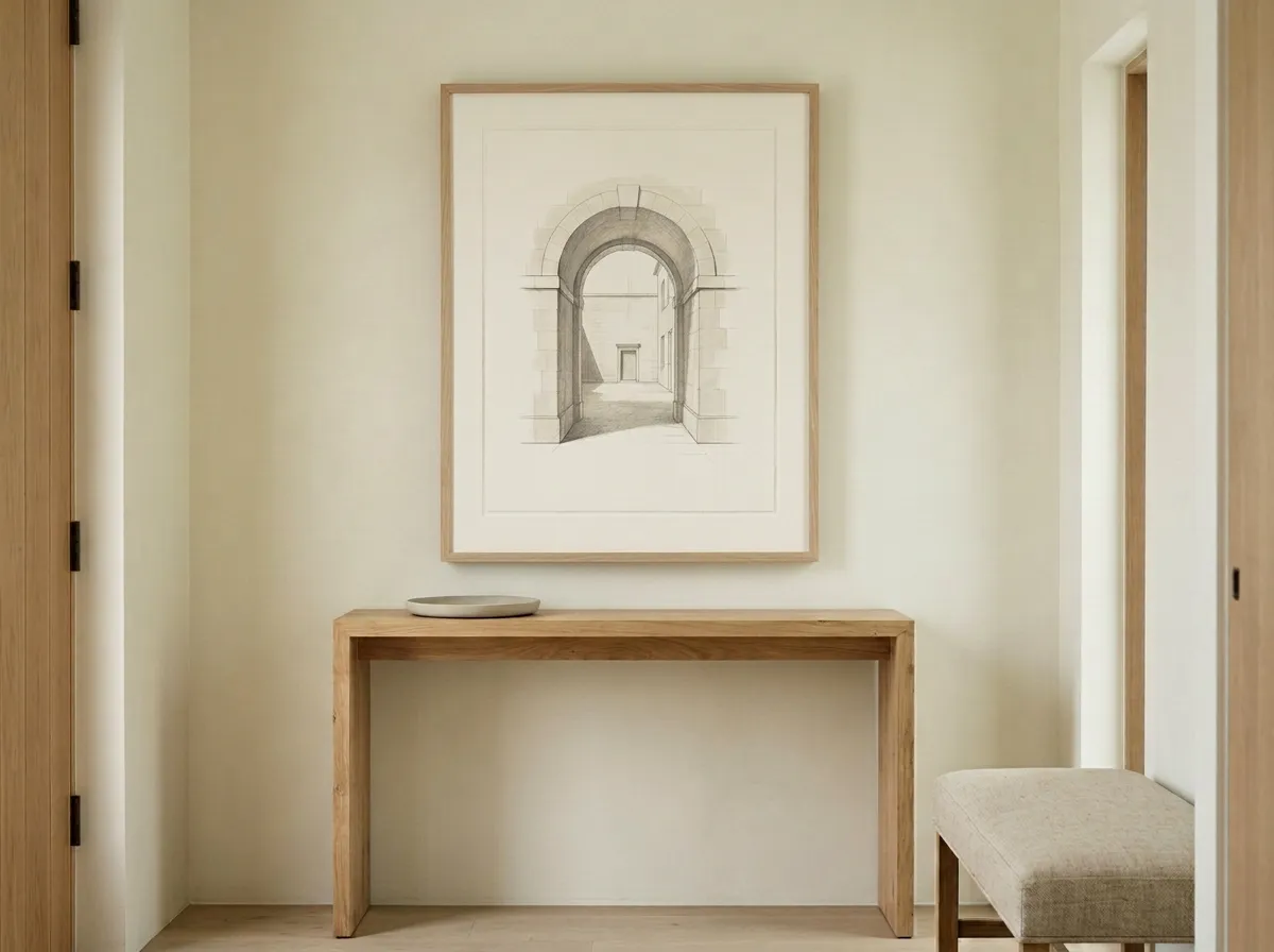
An entryway is a natural showcase for minimalist wall art’s ability to set a tone with very little — one considered piece, seen the moment someone enters, does more to signal an intentional home than a busier arrangement would in the same spot.
Because an entryway console is often the most tempting surface in the home to accumulate small decor, minimalist wall art here benefits from a genuinely empty or nearly empty surface beneath it — the discipline of the surface matters as much as the piece above it.
Scale and Placement for Minimalist Wall Art
Minimalist wall art often works best slightly smaller than the standard sizing formulas used for other styles — closer to 50–60% of furniture width rather than the fuller 60–75% range, with the difference made up in negative space rather than a larger piece. Standard files run up to the 24×36 inch full-quality ceiling, though minimalist pieces rarely call for the maximum size.
Hanging height follows the standard 57-inch centre-height convention for most standalone placements. Because minimalist wall art depends so heavily on the space around it, correct placement matters more here than for busier styles — a well-chosen piece hung too close to other elements loses much of its intended effect.
What to Avoid With Minimalist Wall Art
Confusing sparse with empty. A single undersized, poorly placed piece with no clear intent reads as unfinished, not minimalist — the distinction depends on deliberate scale and placement, not just having less art.
Competing focal points. Minimalist wall art needs to be the room’s clear focal point, or recede entirely — letting it compete with another statement element undermines the restraint the whole room depends on.
Multiple competing colours or undertones. A piece with several strong, competing hues works against the tonal restraint minimalist wall art depends on, even if the composition itself is otherwise well made.
Cluttered surrounding surfaces. A minimalist piece above a cluttered console, desk, or nightstand reads as inconsistent — the discipline needs to extend beyond the art itself.
Treating negative space as leftover space. The empty wall around minimalist wall art is part of the composition, not an area still waiting to be filled with something else.
Minimalist Wall Art by Room — Complete Styling Guide
The table below maps common rooms to sizing, technique, and placement guidance for minimalist wall art.
| Room | Sizing Approach | Best Technique | Placement Note |
|---|---|---|---|
| Living room | Single piece, generous negative space | Silver Grain Film | One clear focal point only |
| Bedroom | 50–60% of headboard width | Muted Canvas | Pair with restrained bedding |
| Home office | Small, desk-facing scale | Carbon Sketch | Sits cleanly within video-call frame |
| Entryway | Small to medium | Smoke & Ink Wash | Pair with an empty console surface |
Recommended Products for Minimalist Wall Art
Everything you need to frame, light, and install minimalist wall art without disrupting the restraint it depends on.
Frequently Asked Questions
Minimalist Wall Art That Earns Its Restraint
The rooms where minimalist wall art works best share a consistent pattern: one clear focal point rather than several competing elements, deliberate negative space rather than leftover space, and scale that’s often smaller than expected on purpose. It’s a style built on doing less, which paradoxically takes more discipline to get right than a fuller, busier room does.
Whether it’s a single quiet piece above a desk or one considered statement above a sofa, the same logic holds throughout. Start with the negative space — decide how much room the piece needs to breathe before deciding on the piece itself.
Shop Silver Grain Film Prints →