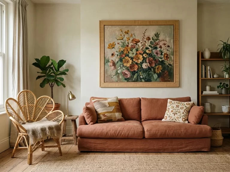
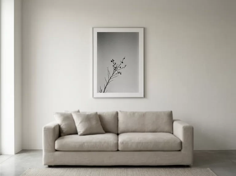
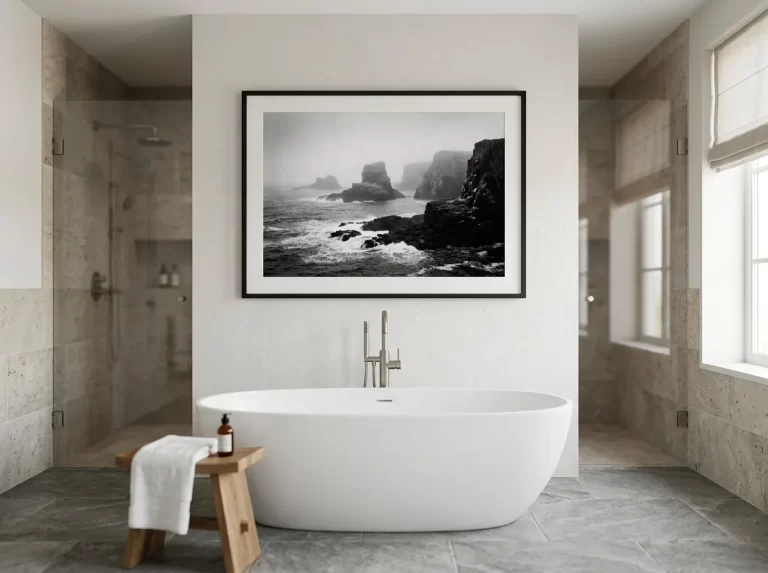
Gold wall art is one of the fastest ways to make a room feel considered rather than merely furnished. Deep, saturated backgrounds paired with warm metallic detailing read as intentional the moment you walk in — a quiet signal of taste that doesn’t rely on scale or clutter to make its case. This guide covers 11 proven rules for where gold wall art works, how to pair it, and how to avoid the handful of ways it can tip into kitsch.
Gold wall art occupies a specific place in interior design: it’s rich without being loud, and dramatic without needing an entire room built around it. A single well-chosen piece can carry an otherwise restrained scheme, which is why it shows up so often in interiors that read as effortlessly elegant rather than expensively decorated.
This guide walks through gold wall art room by room, plus how to pair it with metals and fabrics, when it reads as luxury wall art versus baroque wall art, and the sizing rules that keep a gold-accented piece looking curated rather than incidental.
Gold Wall Art for Living Rooms
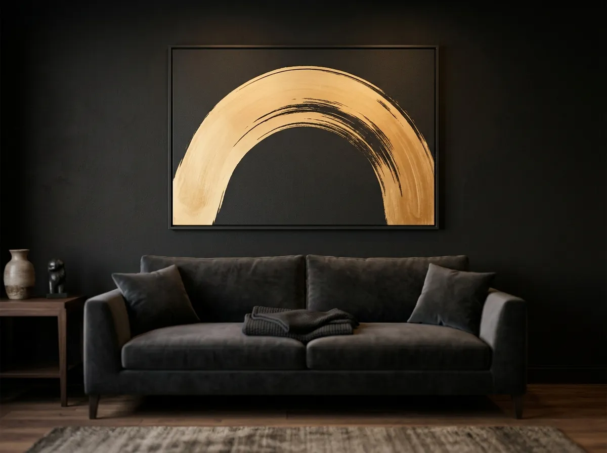
The living room is where gold wall art does its most visible work — it’s the room guests spend the most time in, and the one where a single strong piece can set the tone for the entire space. A large-format Gilt Edge Canvas print above a sofa or fireplace mantel gives the room an anchor that reads as considered from the moment someone walks in.
Gold wall art pairs particularly well with velvet, leather, and other tactile upholstery fabrics, since these materials already carry a similar sense of richness. A charcoal or deep-toned sofa beneath a gold-accented piece creates a tonal relationship that feels deliberate rather than assembled from unrelated pieces.
Gold Wall Art for Dining and Entertaining Spaces
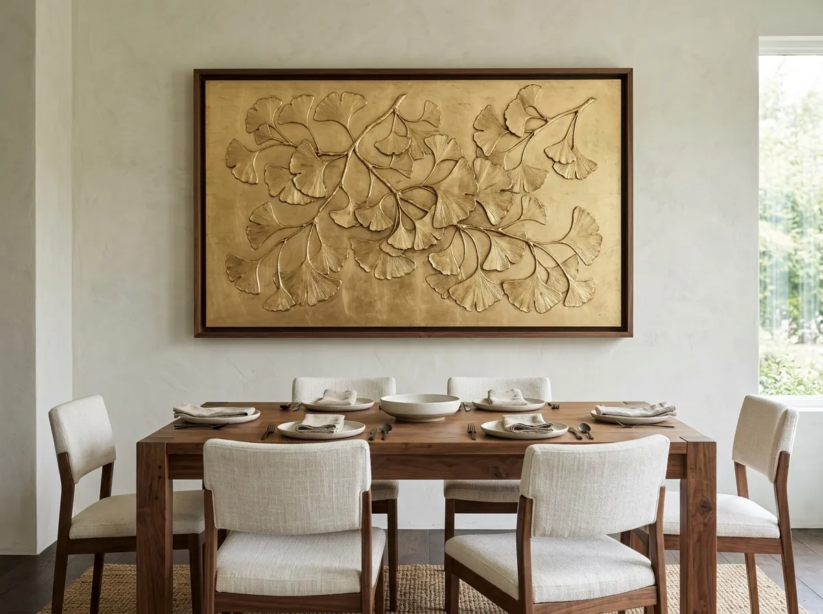
Dining rooms are traditionally where households have always spent the most on decor, and gold wall art suits that tradition well — a dining space is often lit for evening entertaining, which is exactly the kind of warm, low ambient light that gold detailing responds to best.
A single large piece on the wall a seated dinner guest faces gives a dining room presence without requiring elaborate additional decor. Gold wall art here works especially well paired with a dark or richly stained dining table, since the tonal relationship between the wood and the piece’s dark background reads as coordinated.
Gold Wall Art for Bedrooms
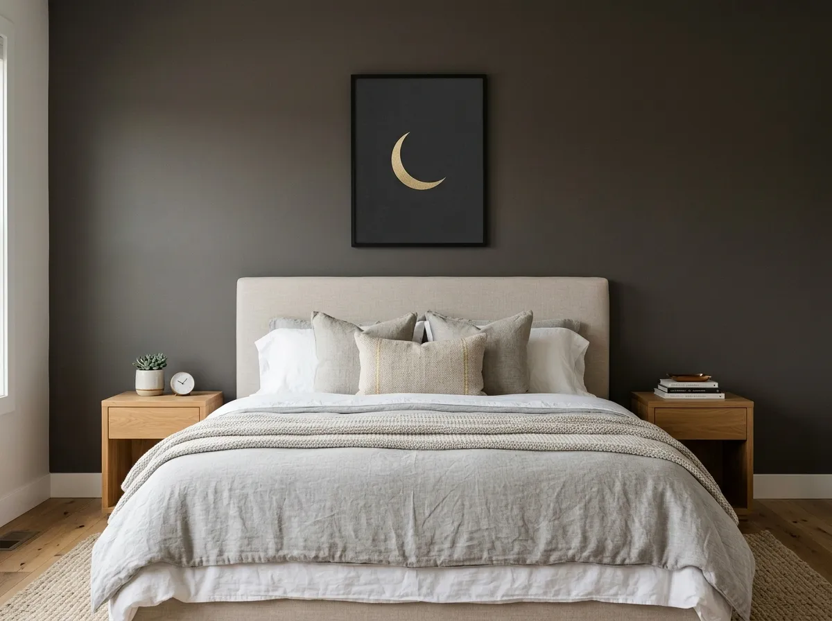
Bedrooms call for a slightly softer application of gold wall art than living or dining spaces — the goal is warmth and richness rather than drama, since this is a room meant for rest rather than entertaining. A single piece above the headboard, sized to 75–80% of the headboard’s width, is the most reliable formula.
Gold wall art with a smaller ratio of gold to background tends to suit bedrooms better than more heavily gilded pieces, which can feel visually busy in a room meant to be calming. Paired with brass or warm-toned bedside lighting, it creates a coherent warm-metal story throughout the room, rather than treating the art and the hardware as unrelated choices.
Gold Wall Art for Entryways and Hallways
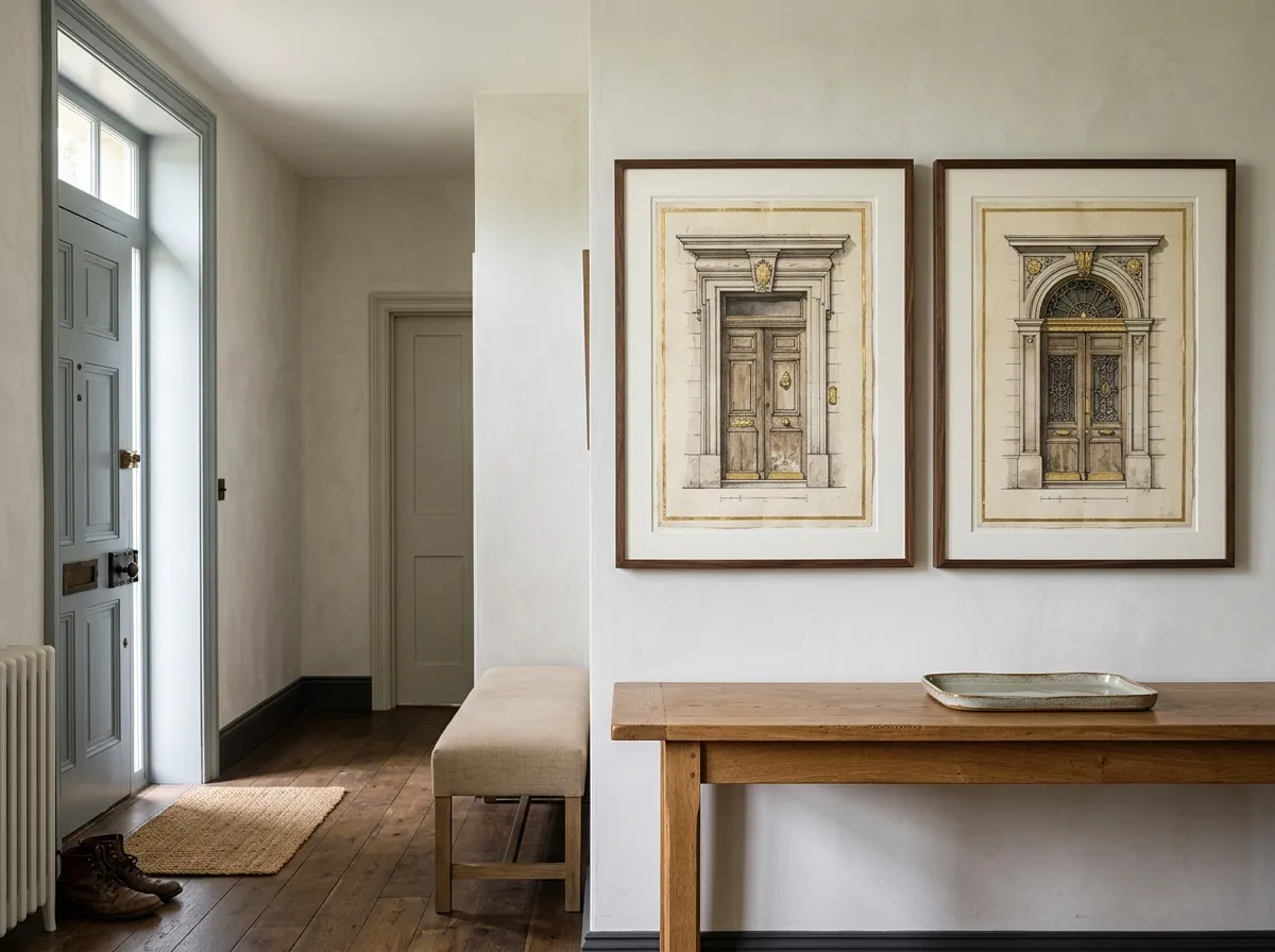
An entryway is seen by every visitor before they’ve had a chance to form any other impression of the home, which makes it one of the highest-leverage places to use gold wall art. A single piece positioned at eye level near the entrance sets an expectation for the rest of the home that a bare or generically decorated entry doesn’t.
In narrower hallways, gold wall art works best as a considered pair or short series rather than a single oversized piece that a hallway’s width can’t properly accommodate. Because entryways are frequently under-lit compared with other rooms, gold wall art benefits especially from a dedicated light source here.
Black and Gold Wall Art — the Classic Pairing
Black and gold wall art is one of the most durable colour pairings in interior design, and for good reason: the contrast does all the work. A deep black or charcoal background makes gold detailing read as considerably more luminous than it would against a lighter tone, which is why so much of the strongest gold wall art leans into near-black backgrounds rather than lighter ones.
This pairing also ages well precisely because it doesn’t chase a specific decor trend — black and gold wall art has read as elegant for decades and shows no sign of feeling dated the way more overtly trend-driven colour choices sometimes do within a few years. For rooms built around a monochrome or greyscale palette, it can introduce warmth without disrupting the existing colour discipline.
Luxury Wall Art and Perceived Value
Gold wall art is one of the most efficient ways to make a room read as luxury wall art territory without the cost of an entirely luxury-furnished space. The perception of richness comes disproportionately from a small number of considered, high-contrast elements rather than from the total spend across every item in the room — and gold-accented art is exactly this kind of high-leverage element.
This matters commercially as much as personally, with consumer appetite for exactly this kind of elevated, considered decor expanding rather than plateauing. For interior designers presenting to clients, gold wall art is a useful tool for signalling a luxury positioning within a single specification line, without requiring the client’s full budget to shift toward higher-end furniture across the board.
Baroque Wall Art Without the Kitsch
Baroque wall art draws on a historic visual language of ornamentation, drama, and rich colour — but translating that language into a contemporary interior requires editing rather than direct reproduction. A gold-accented piece with a genuinely baroque sensibility, reinterpreted with restraint, reads as sophisticated; an overly literal, heavily ornamented reproduction can tip into costume rather than decor.
The most successful baroque wall art in modern interiors borrows the tonal richness and dramatic contrast of the era without the literal ornamental detail — deep shadow, warm gold highlight, and a sense of weight and depth, rather than gilded frames and classical figures. It works best in rooms that can support its intensity — a single statement piece in an otherwise restrained room.
Pairing Gold Wall Art With Metals and Fabrics
Gold wall art reads most cohesively when the room’s existing metal finishes share its warm undertone — brass, aged brass, and warm bronze hardware all sit comfortably alongside it, while cooler finishes like chrome or brushed nickel can create a visual disconnect that’s easy to avoid by checking undertones before finalising a room.
Velvet, silk, and other lustrous fabrics pair naturally with gold wall art, since both share a quality of catching and reflecting light. Where a room already has several gold or brass accents, the art should generally be the largest and most dominant of these, rather than competing for attention with several similarly scaled gold elements.
Which Interior Styles Suit Gold Wall Art
Gold wall art isn’t limited to traditional or classically ornate interiors — its adaptability across styles is part of what makes it such a durable choice.
Modern glam — gold wall art is close to a signature element here, paired with velvet, brass, and lacquered surfaces for a polished, contemporary take on luxury.
Traditional and transitional — deep, warm-toned gold wall art suits richly stained wood furniture and classic upholstery without needing to lean fully period.
Moody minimalism — a single restrained gold-accented piece against an otherwise pared-back, dark-toned room provides warmth without disrupting the minimalist discipline.
Maximalist and eclectic — gold wall art works well grouped with other rich-toned pieces, contributing to the layered, expressive look currently favoured by the majority of design professionals.
Scale and Placement Guidance for Gold Wall Art
Gold wall art depends more heavily on correct scale than most other styles, because an undersized piece loses the dramatic impact that’s the entire point of choosing it. Above a sofa or bed, follow the standard 60–80% of furniture-width formula. Standard files run up to the 24×36 inch full-quality ceiling; as a standalone statement piece on a larger open wall, a same-technique triptych keeps every panel at full quality while still reading as one cohesive statement.
Hanging height follows the standard 57-inch centre-height convention for most standalone placements. Lighting is as important as size for gold wall art specifically — a piece with genuine metallic or warm-toned detailing needs some directional light source to read at its intended richness.
What to Avoid With Gold Wall Art
Too much gold, not enough contrast. Pieces where gold dominates the composition rather than accenting a dark background tend to read as costume rather than considered decor.
Mismatched metal undertones. Cool-toned hardware and fixtures alongside warm gold wall art create a subtle but persistent visual friction most people notice without being able to name.
Undersizing the piece. Gold wall art depends on scale for its impact more than most styles — a piece that’s too small simply doesn’t deliver the drama it’s chosen for.
Flat ambient lighting only. Without some directional light, the metallic detailing that makes gold wall art distinctive can look muted and unremarkable.
Competing with equally ornate surroundings. Baroque or heavily gilded pieces need a comparatively restrained room around them to stand out; surrounded by equally busy decor, the effect gets lost.
Gold Wall Art by Room — Complete Styling Guide
The table below maps common rooms to sizing, pairing, and placement guidance for gold wall art.
| Room | Sizing Approach | Best Pairing | Placement Note |
|---|---|---|---|
| Living room | 60–75% of sofa width | Velvet, leather, dark upholstery | Above sofa or fireplace mantel |
| Dining room | Large statement piece, up to 24×36″ | Dark or richly stained wood table | Wall facing seated diners |
| Bedroom | 75–80% of headboard width | Brass or warm-toned bedside lighting | Above headboard, softer gold ratio |
| Entryway / hallway | Eye-level single piece or paired series | Warm directional lighting | Visible from front door |
| Monochrome room | Single statement piece | Black, white, grey palette | Sole source of colour in the room |
Recommended Products for Gold Wall Art
Everything you need to frame, light, and maintain gold wall art at the scale and finish this style depends on.
- Browse our complete Wall Art Ideas guide for every space
- See our Muted Canvas and Moody Interiors guide for the cooler-toned counterpart to this style
- Read our Interior Design Wall Art guide for presenting gold-accented pieces in client proposals
- See our Botanical Wall Art for Warm Rooms guide for a softer warm-toned alternative
Frequently Asked Questions
Gold Wall Art That Earns Its Place in the Room
The rooms where gold wall art works best share a consistent logic: one considered, correctly scaled piece, given the contrast and lighting it needs to read as intentional, rather than several competing gold elements diluting the effect. It’s a style that rewards restraint in the surrounding room and confidence in the piece itself.
Whether the goal is a single black and gold statement above a sofa, a baroque-influenced piece with genuine tonal depth, or a softer gold-accented print for a bedroom, the same principles hold. Start with contrast over coverage, and scale over caution — the lighting is the easy part once those two are right.
Shop Gilt Edge Canvas Prints →