Botanical wall art for warm rooms is one of the most widely chosen and most widely mishandled art categories available. The subject is enduringly appealing — natural forms, organic colour, the visual reference to living things — but the quality range is enormous. This guide covers 12 specific approaches, with honest guidance on what separates botanical wall art for warm rooms that elevates a space from the kind that merely fills it.
Biophilic design — the integration of natural elements into built environments — has moved decisively from trend to mainstream practice. Realtor.com’s 2025 trend report ranks biophilic and indoor-outdoor features second among the fastest-growing listing trends, and botanical wall art is the most accessible, most practical biophilic design element available for almost any budget.
The science behind it is solid. Yin, Zhu, MacNaughton, Allen, and Spengler’s 2018 study in Building and Environment found biophilic indoor environments produced 8.6 mmHg lower systolic blood pressure and a 14% improvement in short-term memory compared to non-biophilic settings. Botanical wall art, as the most accessible biophilic design element, sits at the centre of this movement.
Botanical Wall Art for Warm Rooms: What Makes It Work
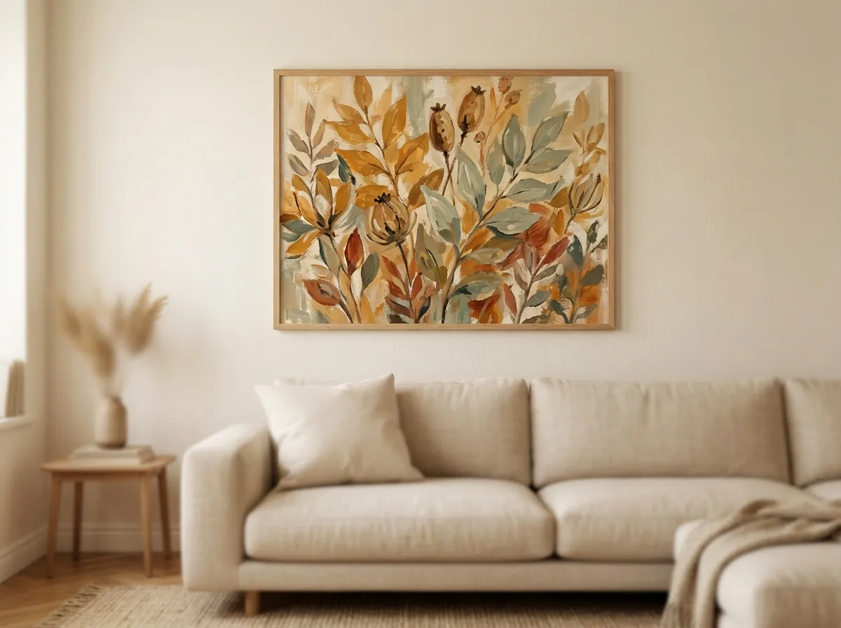
Botanical wall art for warm rooms fails for one consistent reason: the palette conflict. A flat, highly saturated botanical print — vivid green on stark white — introduces a cool, crisp quality that fights the warmth of a room built around natural materials, linen textiles, warm wood, and amber lighting.
Warm room botanical wall art needs desaturated, warm-toned colour — greens that pull toward linen, sage, or muted olive; yellows that pull toward ochre and amber rather than lemon; pinks that desaturate toward dusty rose rather than saturated coral. Serving that biophilic need well requires palette discipline, not just subject matter.
The second factor is technique. A flat digital botanical illustration — however accurately rendered — reads as decorative. A botanical study in impressionist oil paint, or in loose watercolour wash, or in warm-toned ink, reads as art. The distinction is in the visible process: brush marks, wash qualities, tonal depth, and the evidence of a specific approach to rendering the subject.
Impressionist Meadow: Botanical Wall Art for Warm Rooms and Living Spaces
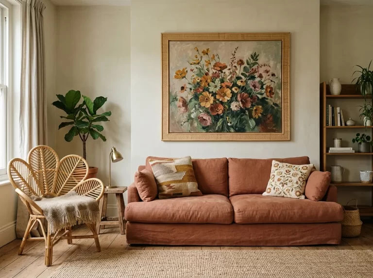
The Botanical Meadow technique — loose impressionist brushwork, warm oil-paint tones, sun-drenched European wildflower compositions — is the botanical wall art for warm rooms style most naturally suited to warm living rooms. The impressionist quality means the colour is mixed optically rather than applied flat: ochres and ambers sit beside desaturated greens and dusty roses in a visual relationship that reads as warm, alive, and genuinely painted rather than printed.
For a warm living room with linen upholstery, oak or walnut furniture, and cream or warm white walls, a 24×32 inch Botanical Meadow print above the sofa creates the room’s defining visual element. The two-thirds furniture width rule applies: an 84-inch sofa calls for botanical wall art around 55–56 inches wide — beyond a single panel, which means a same-technique triptych, evenly spaced, is the right way to reach that width without exceeding the 24×36 inch single-panel quality ceiling on any individual print.
Botanical Wall Art for Warm Kitchens and Dining Rooms
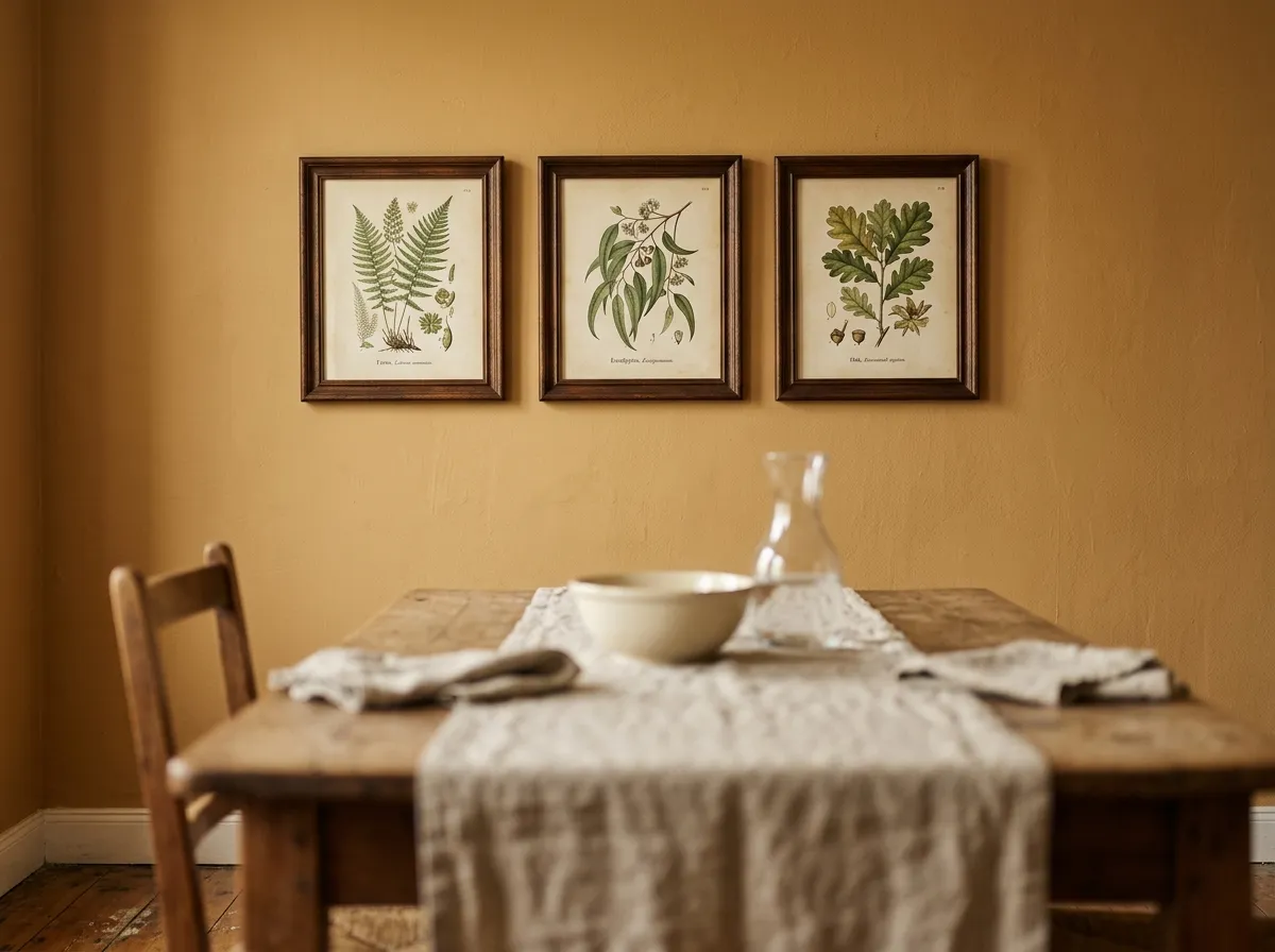
The kitchen and dining room are the domestic spaces where botanical wall art for warm rooms has the longest and most consistent tradition — and where it most commonly goes wrong. Generic botanical prints in thin frames, accumulated without a unifying logic, are among the most common visual failures in domestic kitchens. The subject is right; the execution is not.
Warm kitchen and dining botanical wall art works when it follows two principles: technique consistency within a space, and palette warmth. A triptych of three Botanical Meadow studies in simple white or natural wood frames, hung at consistent spacing above a kitchen dining table, reads as a considered design decision. Three individually sourced botanical prints in three different styles reads as accumulation.
Muted, Calm Botanical Wall Art for Warm Rooms: the Bedroom
Botanical wall art for warm rooms requires a different calibration in the bedroom than in the living room or kitchen. The bedroom’s function is rest, and the art should support that function rather than introduce visual energy. The worst choice for a bedroom is bright, saturated, highly detailed botanical illustration that demands active looking rather than passive visual engagement.
The botanical wall art that genuinely serves a warm bedroom is muted, loose, and tonally restrained — a wildflower study where the palette has been softened toward linen and sage, with the background tonal wash doing most of the visual work while the plant forms emerge from it gently rather than asserting themselves.
For placement above a warm-toned bed, a single 24–32 inch Botanical Meadow print in a muted warm palette creates the room’s most considered element. See our Bedroom Wall Art Ideas guide for deeper sizing across every bed size.
Triptych Botanical Wall Art for Warm Rooms — Three Prints as One Composition
A triptych of three related botanical prints — three wildflower studies from the same technique family, in a consistent warm palette — is one of the most satisfying botanical wall art arrangements for warm rooms, because it combines the visual weight of a larger piece with the compositional rhythm of a series, while keeping every individual panel within the 24×36 inch full-quality ceiling.
The principle for a successful botanical triptych is related variety: the three prints should share palette and technique without being identical in subject. Three Botanical Meadow prints, each depicting different wildflower subjects in the same warm oil-paint palette, read as a composed series. Three identical prints in three frames read as a retail decision.
Large-Scale Botanical Wall Art for Warm Rooms and Biophilic Spaces
The biophilic design movement’s central principle — that humans are biologically predisposed to feel calmer and more creative when natural elements are present — suggests a single large-scale botanical print provides more physiological benefit than several smaller ones. The Terrapin Bright Green “14 Patterns of Biophilic Design” framework identifies repeated and sustained nature connection, not occasional accent elements, as the key principle across biophilic design research.
Large-scale botanical wall art for warm rooms — at or near the 24×36 inch single-panel maximum — provides exactly this sustained connection. In a living room where the print occupies a significant portion of the primary visual field, the botanical subject operates as a continuous background presence rather than a detail to be noticed and then ignored.
Botanical Wall Art for North-Facing Warm Rooms
North-facing rooms present the specific challenge that botanical wall art for warm rooms is most called upon to solve: cool, indirect light that can make warm-material rooms read as cold and draining by afternoon. Botanical wall art in warm ochre, amber, and sage tones introduces visual warmth that compensates for the absence of direct natural light throughout the day.
For north-facing rooms specifically, avoid delicate line-art botanical illustrations on white backgrounds, cool blue-green palettes, and precise scientific-illustration style. Botanical Meadow prints in warm impressionist oil paint, or Amber Varnish botanical studies with honey-warm tones, are the categories that introduce genuine warmth a north-facing room’s light cannot provide.
Dark Botanical Wall Art for Warm Eclectic Rooms
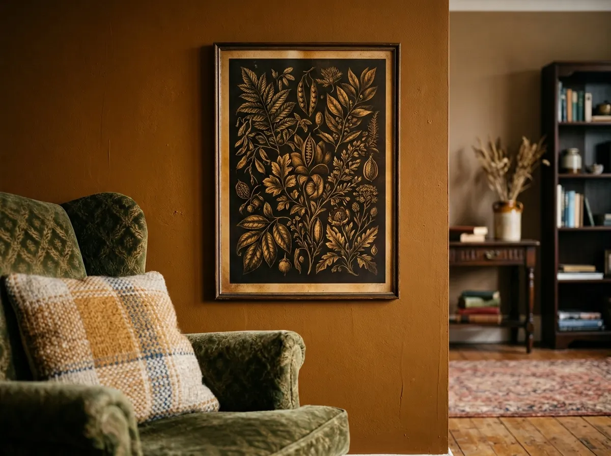
Not all warm rooms are pale or natural in palette. Eclectic and maximalist warm rooms — with deep jewel tones, rich textiles, layered objects, and warm artificial lighting — create a context for botanical wall art for warm rooms that is darker, richer, and more dramatic than the standard impressionist meadow approach.
The Amber Varnish technique — warm honey-amber glazes over dark antique bases — provides a specific quality for eclectic warm rooms: the amber quality reads as both luminous and aged, suggesting the visual weight of an old master’s botanical study rather than a contemporary print.
Watercolour and Ink Wash — Two More Styles of Botanical Wall Art for Warm Rooms
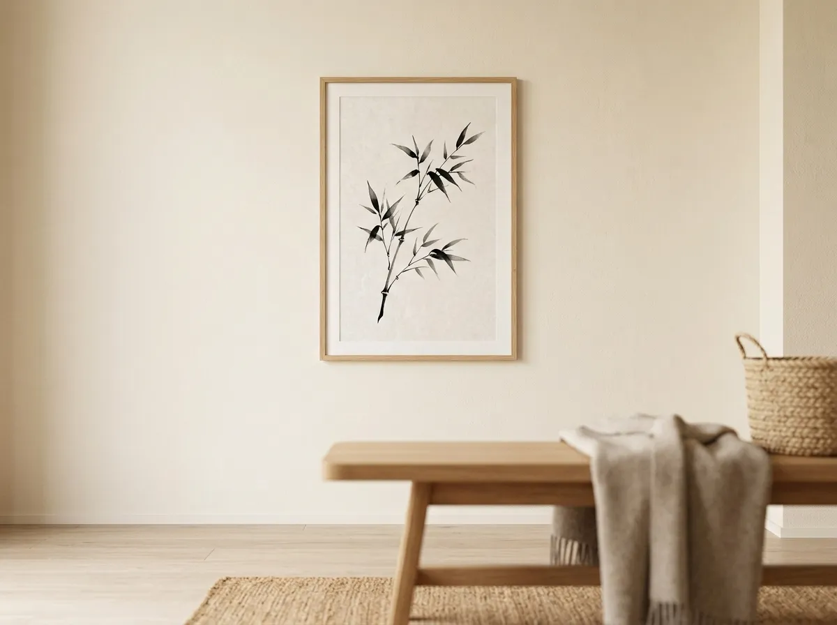
Beyond the Botanical Meadow oil-paint impressionist technique, two related styles offer botanical wall art for warm rooms with different aesthetic registers. Watercolour botanical prints — translucent, layered, with visible wash marks and soft edges — read as delicate and studied. Ink-wash botanical prints — East Asian in tradition, with bold brush strokes and significant negative space — read as graphic and architectural.
Watercolour suits warm rooms with a more refined or restrained aesthetic — traditional interiors, rooms with antique furniture. Ink-wash provides a more minimal and meditative botanical quality, belonging to warm rooms with Japandi or East Asian aesthetic influence.
Botanical Wall Art for Boho and Natural Material Warm Interiors
Boho Chic was the most popular interior design style across the US in 2025, with a 44.9% appeal rate preferred in 40 states, and it creates the ideal context for warm impressionist botanical wall art. The defining elements of Boho interiors — rattan, jute, macramé, warm earth tones, layered textiles, terracotta and sage — provide the material palette that warm impressionist botanical prints were developed to complement.
For Boho warm rooms, gallery arrangements of botanical wall art are more appropriate than in other contexts, because the layered, collected aesthetic of Boho interiors suits a wall of accumulated botanical studies. The key is palette consistency across all pieces.
What to Avoid in Botanical Wall Art for Warm Rooms
Flat digital illustration on bright white. The cool white background fights the room’s warmth regardless of the botanical subject’s quality. Specify cream, warm white, or toned backgrounds rather than stark white.
Saturated vivid green. The green in warm-room botanical wall art should be desaturated toward sage, muted olive, or grey-green. If the green reads as vivid in isolation, it will compete with the warm room rather than complement it.
Mixed technique gallery walls. A wall with a photographic botanical print beside a flat illustration beside a watercolour study beside an impressionist oil reads as an accumulation of botanical interest rather than a considered collection.
Undersized prints in large rooms. A small botanical print in a large warm living room reads as a postcard. Botanical wall art needs to be at the correct scale for the room and the wall position, regardless of how beautiful the print is at close range.
Botanical Wall Art for Warm Rooms — By Room and Interior Style
The table below maps warm room types and interior styles to the most effective botanical wall art for warm rooms — techniques, sizes, and placements for each.
| Room / Style Context | Best Technique | Palette | Size and Placement |
|---|---|---|---|
| Warm living room (linen, oak) | Botanical Meadow — impressionist oil | Ochre, amber, muted sage | 24×36″ above sofa, or triptych |
| Kitchen and dining | Botanical Meadow — warm triptych | Warm green, ochre, dusty rose | 3 × 16–20″ above dining table |
| Warm bedroom (rest focus) | Botanical Meadow — muted, restrained | Sage, dusty rose, linen | 24–32″ above headboard |
| North-facing room | Botanical Meadow or Amber Varnish | Warmest available — ochre and amber | 24–32″, one large piece |
| Boho / eclectic warm room | Botanical Meadow — gallery arrangement | Ochre-sage-terracotta family | Gallery wall, natural frames |
| Dark eclectic / maximalist | Amber Varnish botanical | Deep warm backgrounds, amber accents | 24×36″, single feature wall piece |
| Japandi / minimal warm | Smoke & Ink Wash botanical | Warm neutral — cream, grey, soft sage | 20–28″, one piece, generous empty space |
| Traditional / antique-influenced | Watercolour botanical — precise study | Warm cream ground, muted natural tones | 16–24″ per piece, series or pair |
Recommended Products for Botanical Wall Art in Warm Rooms
Everything you need to source, frame, and hang botanical wall art for warm rooms at the right scale and finish.
- See our Modern Wall Art for Any Interior guide for the full range of interior styles
- Read the complementary guide to dark, atmospheric art in our Muted Canvas Art for Moody Interiors guide
- See our Home Office Wall Art guide for botanical placement supporting focus
- Browse our complete Wall Art Ideas guide for every space
Frequently Asked Questions
Botanical Wall Art for Warm Rooms That Belongs to the Space
The most effective botanical wall art for warm rooms is not the most botanically detailed, the most currently fashionable, or the most widely available. It is the print whose palette belongs to the room’s warmth, whose technique communicates craft rather than decoration, and whose scale is large enough to provide the sustained biophilic presence that research consistently attributes to meaningful benefit.
Start with the room’s primary wall. Get the palette, technique, and scale right there, and the rest of the room follows the same logic.
Browse Botanical Prints →