Modern wall art for any interior shares one quality: it belongs to the room rather than merely occupying it. This guide covers 12 approaches that hold their place across the widest range of interior styles — from warm minimalism to layered maximalism — with honest guidance on what works and why.
The global wall art market is projected to grow from roughly $67 billion in 2025 to nearly $119 billion by 2032, reflecting a sustained shift in how people invest in their living spaces. More prints are being bought than at any previous point, and more choices are available. The difficulty is no longer finding modern wall art — it’s identifying which choices will still work as interior styles evolve and personal taste matures.
The 2025 1stDibs Designer Trends Survey of 643 professional interior designers found maximalism (33%) and eclecticism (33%) had overtaken minimalism and mid-century modernism as the leading direction, with mid-century modern preference dropping sharply from 40% to 20% year over year. That volatility at the top makes durable, technique-first modern wall art — rather than trend-following pieces — the safer long-term choice.
Modern Wall Art for Any Interior: the Large-Scale Statement Piece
The most durable design principle in modern wall art is also the simplest: one oversized print, correctly scaled, on the dominant wall. The broader shift away from cluttered gallery walls toward single confident choices reflects a growing awareness that scale, not quantity, is the variable that matters most.
The appeal is practical as well as aesthetic. A single large-format print — the largest size that maintains full print quality is 24×36 inches — anchors a room with less risk of the visual incoherence gallery walls introduce when assembled without design experience. One well-chosen piece of modern wall art communicates intention; ten smaller pieces communicate effort.
For a standard living room sofa wall, size the anchor print to roughly two-thirds of the sofa’s width. An 84-inch sofa calls for art around 55–56 inches wide — beyond the single-panel ceiling, which means a triptych of same-technique 24×36 inch or smaller panels, evenly spaced, is the right way to reach that width without sacrificing quality in any individual print.
Muted Tonal Landscapes — Modern Wall Art That Holds Across Styles
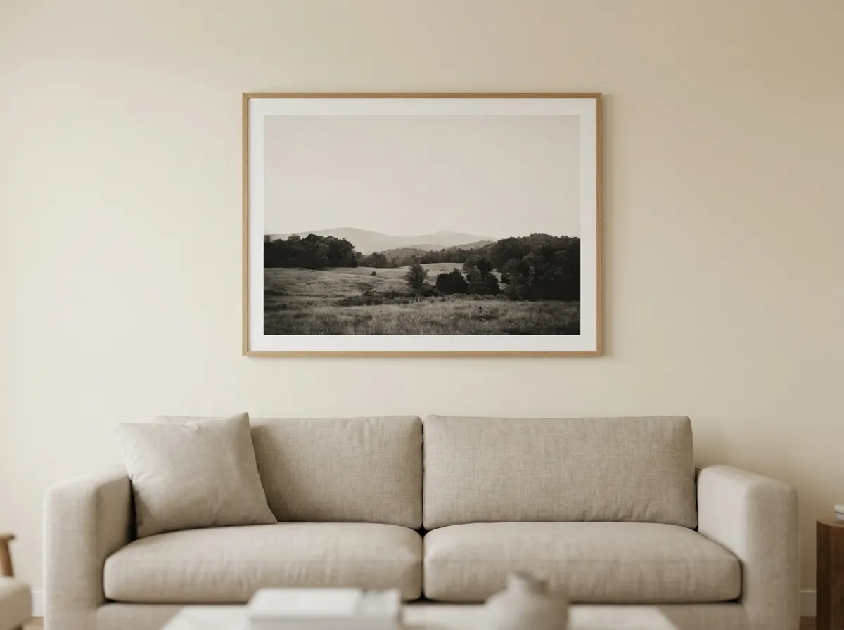
Among all categories of modern wall art for any interior, desaturated tonal landscape prints have the widest cross-style appeal and the longest aesthetic lifespan. They don’t belong to a specific design movement the way geometric abstract art belongs to mid-century modernism, or maximalist florals belong to eclectic spaces. A muted landscape in deep tonal range — charcoal, warm grey, dusty linen — reads as considered in a minimalist interior, a warm Scandinavian space, a mid-century modern room, and an eclectic layered interior alike.
The reason is tonal restraint. These prints don’t introduce colour-temperature competition with a room’s existing palette — they read within the warm-neutral range that most modern interiors share, regardless of specific style direction. This is also the category that ages best: trend-specific prints date visibly within three to five years, while a tonal landscape in an accomplished technique dates far more slowly.
Modern Wall Art for Warm Minimalist Interiors
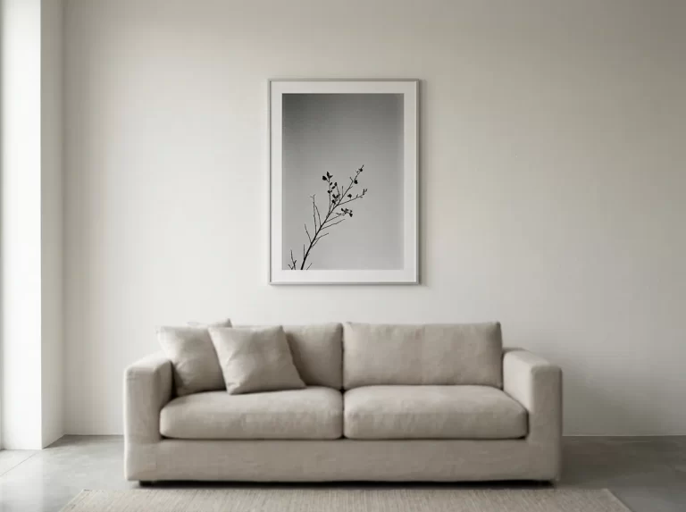
Warm minimalism — the evolution of Scandinavian minimalism toward warmer palettes, natural materials, and tactile texture, without abandoning clean lines and uncluttered surfaces — is one of the more demanding contexts for choosing modern wall art for any interior: a single piece with real presence, in a warm or neutral palette, with enough visual texture or tonal depth to read as meaningful against a clean background.
The worst choice for a warm minimalist interior is art that reads as blank at a distance — pale, flat, and textureless. A tonal, atmospheric study, or a textured charcoal-style print with visible paper grain and smudged edges, introduces the right level of visual complexity for a minimalist context — enough to reward the eye without overwhelming the room’s fundamental quietness.
Monochrome Modern Wall Art for Contemporary Interiors
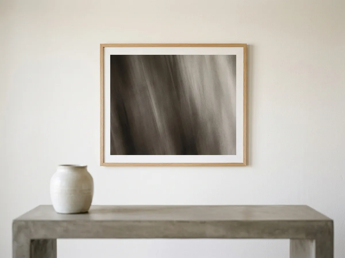
Monochrome modern wall art for any interior — black, white, and the full tonal range between — is consistently cited as one of the most enduringly popular categories, specifically because it pairs with virtually any interior style without colour-temperature conflict. A contemporary interior with white walls and dark wood furniture accommodates monochrome naturally; so does a warm cream interior with linen textiles and oak. The palette adapts to its context rather than defining it.
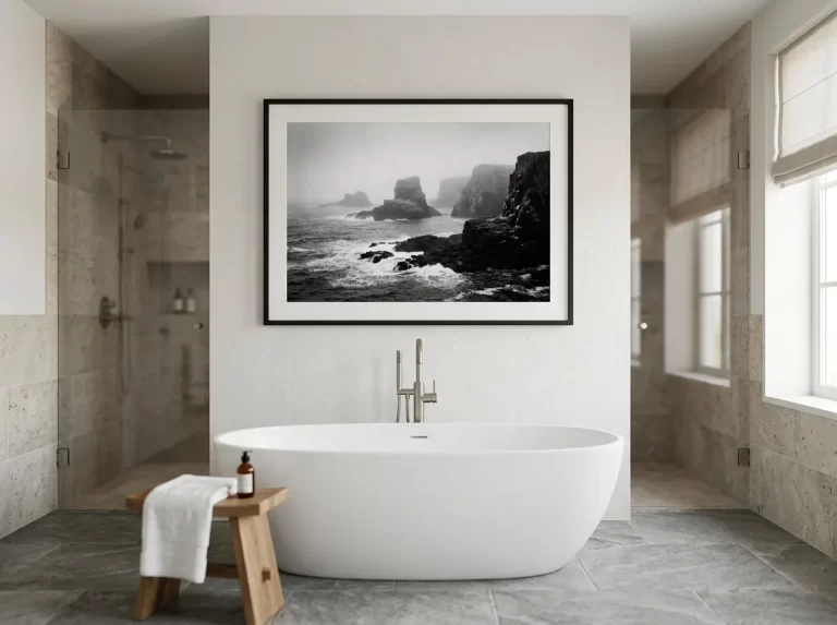
The critical distinction is between tonal monochrome — long, warm gradients from deep near-black through warm grey to off-white — and graphic monochrome — high-contrast black on white with strong pattern or geometric structure. Tonal monochrome reads as atmospheric and warm; graphic monochrome reads as designed and cool. Both are legitimate, but they serve different contexts: tonal for warm, organic, natural-material interiors; graphic for contemporary, geometric, design-led spaces.
Botanical Modern Wall Art for Eclectic and Natural Interiors
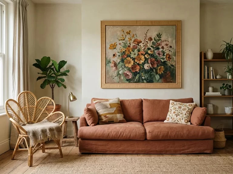
Botanical prints are among the most consistently purchased categories of modern wall art for any interior — and also the most variable in quality. A flat, digitally rendered botanical illustration on bright white reads as mass-market regardless of subject. A botanical study rendered in impressionist warm oils — loose brushwork, desaturated naturalistic colour, visible paint texture — reads as craft.
Boho Chic was the most popular interior design style across the US in 2025, with a 44.9% appeal rate preferred in 40 states, according to analysis of over 535,000 design quiz responses. The natural materials, warm earth tones, and organic forms that define Boho Chic interiors create the ideal context for warm impressionist botanical prints — ochre meadow prints, loose wildflower studies, and desaturated green botanical compositions belong to this aesthetic more naturally than any other modern wall art category.
Dark-Field Modern Wall Art for Maximalist Rooms
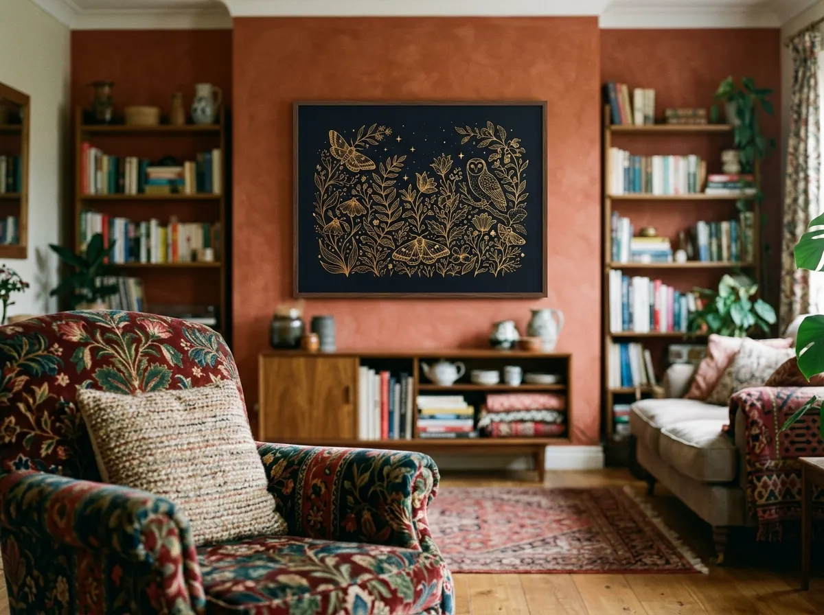
The 33% of professional designers who cited maximalism as their leading 2025 direction are working in rooms that can absorb significantly more visual weight than minimalist spaces. In a maximalist interior — layered textiles, rich colour, pattern, and multiple decorative elements — the worst modern wall art choice is a pale, delicate piece that disappears into the surrounding complexity. Maximalist rooms need genuine presence.
Dark-field prints — deep, dark backgrounds against which subjects emerge with warmth and detail — are some of the most reliable modern wall art for any interior with a maximalist bent, because the dark field creates a contained visual boundary. A piece with a midnight-dark background and warm gold-accented subject edges reads as a framed aperture in a busy room, rather than merging with it.
Textured and Gestural Modern Wall Art — Technique Over Trend
The broader interior design shift toward tactile, material-rich spaces — textured wall finishes, limewash paint, bouclé upholstery, raw linen — creates a specific context for modern wall art for any interior with visible surface quality. A flat digital print reads as at odds with a tactile room. A print that communicates surface — heavy brushwork, visible paper grain, translucent wash qualities — belongs to a tactile interior in a way that smooth digital art doesn’t.
Gestural prints that show the mark of a specific process also signal authenticity at a moment when AI-generated imagery has made people increasingly sensitive to the distinction between human craft and automated output. A charcoal-style print with visible smudge and drawn edges communicates a specific human process in a way that’s increasingly valued precisely because it can’t be reduced to algorithmic production.
Modern Wall Art for Scandinavian-Influenced Interiors
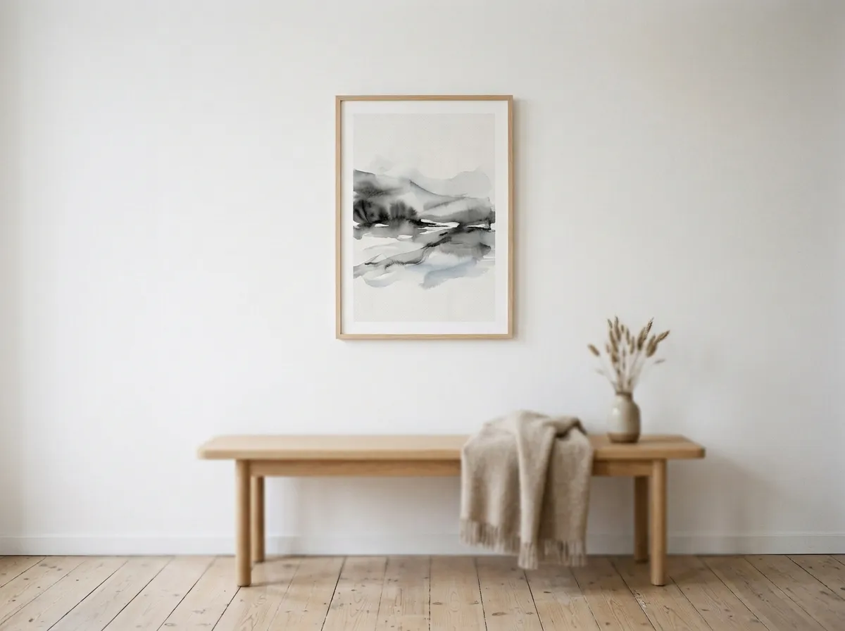
Scandinavian interior design — light wood, white or pale walls, clean functional furniture, careful use of natural materials and light — creates a specific brief for modern wall art for any interior working within that restraint. The room’s visual restraint means art carries more weight per piece than in a denser, eclectic space. A single carefully chosen print defines a Scandinavian room’s personality; the same print in a maximalist space would be one element among many.
Atmospheric, translucent ink-wash prints belong to Scandinavian-influenced interiors more naturally than almost any other category. The visual language shares the Scandinavian sensibility: restraint, negative space, precision, and the elevation of a single gestural mark over accumulative decoration.
Warm-Toned Modern Wall Art for Mid-Century Modern Interiors
Mid-century modern interiors — teak and walnut furniture, clean architectural lines, warm organic forms, a palette of ochre, olive, and burnt orange — provide a specific palette context for modern wall art for any interior built around this style. Designer preference for mid-century modernism dropped sharply from 40% to 20% between 2024 and 2025 in the 1stDibs survey, suggesting the style’s peak mass adoption has passed and it’s entering the more enduring phase of a classic rather than a trend.
The most successful modern wall art for mid-century modern interiors draws from the same warm, organic palette as the furniture: amber-warm tones, botanical forms echoing the period’s nature-inspired ornament, and gestural quality referencing the abstract expressionism contemporaneous with the style’s golden era. Amber Varnish prints — warm honey-amber glazes over dark antique bases — read as naturally at home in a mid-century modern room as a classic mid-century chair.
Modern Wall Art That Performs Under Warm or Low Artificial Light
Most modern wall art for any interior is evaluated in daylight or retail lighting, then displayed where it’s experienced primarily under warm, low-intensity artificial light — the conditions of evening domestic life. The gap between selection conditions and display conditions is the source of more modern wall art disappointment than any other single factor.
Under warm (2700K) artificial light at low intensity, pale and pastel art loses tonal definition and can appear washed out. Cool-toned art — blues, greys, cool whites — reads as cold rather than as the calm contrast it appeared in daylight. Dark-field prints with warm mid-tones are developed specifically to perform in these conditions.
The Diptych and Triptych — Modern Wall Art as a Composed Series
Two or three related prints hung as a diptych or triptych is one of the most useful ways to scale modern wall art for any interior — it combines the scale advantage of multiple pieces with the visual coherence of a single design intention, and it’s the correct way to cover a wide wall while keeping every individual panel within the 24×36 inch full-quality ceiling. Done correctly, a diptych reads as one composed work in two panels. Done incorrectly, with unrelated prints at inconsistent spacing, it reads as separate purchases that happen to share a wall.
The key principle is visual relationship without literal repetition — two prints from the same collection sharing technique, palette, and tonal logic, without being identical. Spacing is the most technically demanding part: 2–3 inches between frames reads as intentional and composed; less reads as one piece cut in two; more reads as unrelated pieces near each other.
Modern Wall Art for Any Interior — By Style
The table below maps common interior design styles to the modern wall art for any interior techniques, palettes, and placements that tend to work best. Use it as a starting point, adjusting for your room’s specific light direction and colour palette.
| Interior Style | Best Technique | Palette | Size and Placement |
|---|---|---|---|
| Warm minimalism | Smoke & Ink Wash or Carbon Sketch | Neutral, warm, low saturation | One large piece, 24×36″, at 57″ centre height |
| Scandinavian / Nordic | Smoke & Ink Wash or Silver Grain Film | Cool neutral — white, grey, pale linen | One piece per wall, 2/3 furniture width |
| Boho / eclectic | Botanical Meadow or Amber Varnish | Warm earth tones, desaturated greens | Triptych or single anchor, warm palette throughout |
| Mid-century modern | Amber Varnish or Botanical Meadow | Ochre, amber, warm olive, linen | Above credenza or sideboard, horizontal composition |
| Contemporary / modern | Muted Canvas or Silver Grain Film | Dark-tonal or warm monochrome | Single 24×36″ statement piece, feature wall |
| Maximalist / eclectic | Gilt Edge Canvas or Muted Canvas | Deep, dark-field with warm accents | 24×36″ anchor, defined art wall within busy room |
| Industrial / loft | Silver Grain Film or Carbon Sketch | Monochrome, cool grey, raw | Large format triptych, minimal framing |
| Coastal / nautical | Silver Grain Film coastal or Smoke & Ink Wash | Cool monochrome, pale linen, muted blue-grey | Bedroom anchor + bathroom detail piece |
Recommended Products for Modern Wall Art for Any Interior
Everything you need to source, frame, and hang modern wall art at the right scale, style, and finish for your interior.
Frequently Asked Questions
Modern Wall Art That Belongs Rather Than Decorates
The distinction between modern wall art for any interior that belongs to a room and modern wall art that merely decorates it is the difference between a considered choice and a purchasing decision. Scale, technique, palette, and placement are the variables — and getting them right, in any interior style, produces art that becomes part of how the room is experienced.
All eight MutedCanvas techniques are built for exactly this standard — specific enough to be worth choosing, durable enough to be worth living with.
Browse All Eight Techniques →