Home office wall art that actually improves focus is not the same as home office wall art that looks nice in a desk tour photo. This guide covers 12 specific approaches — what to choose, where to hang it, and why certain techniques work harder in a workspace than others.
More than 35 million Americans now work from home at least part of the week, according to the US Bureau of Labor Statistics. Most of them are working in spaces that were never designed for sustained concentration — spare bedrooms, dining tables, kitchen corners. The art on those walls, if there is any, was chosen for a different context entirely.
Home office wall art is not a decorating problem. It is a performance environment problem. The art in a workspace affects cognitive state, attention recovery, and the quality of concentrated work in ways that living room or bedroom art simply does not. These 12 home office wall art ideas are organised by function — what each approach does for your working environment, not just how it looks.
Home Office Wall Art: The Single Focus Anchor Print
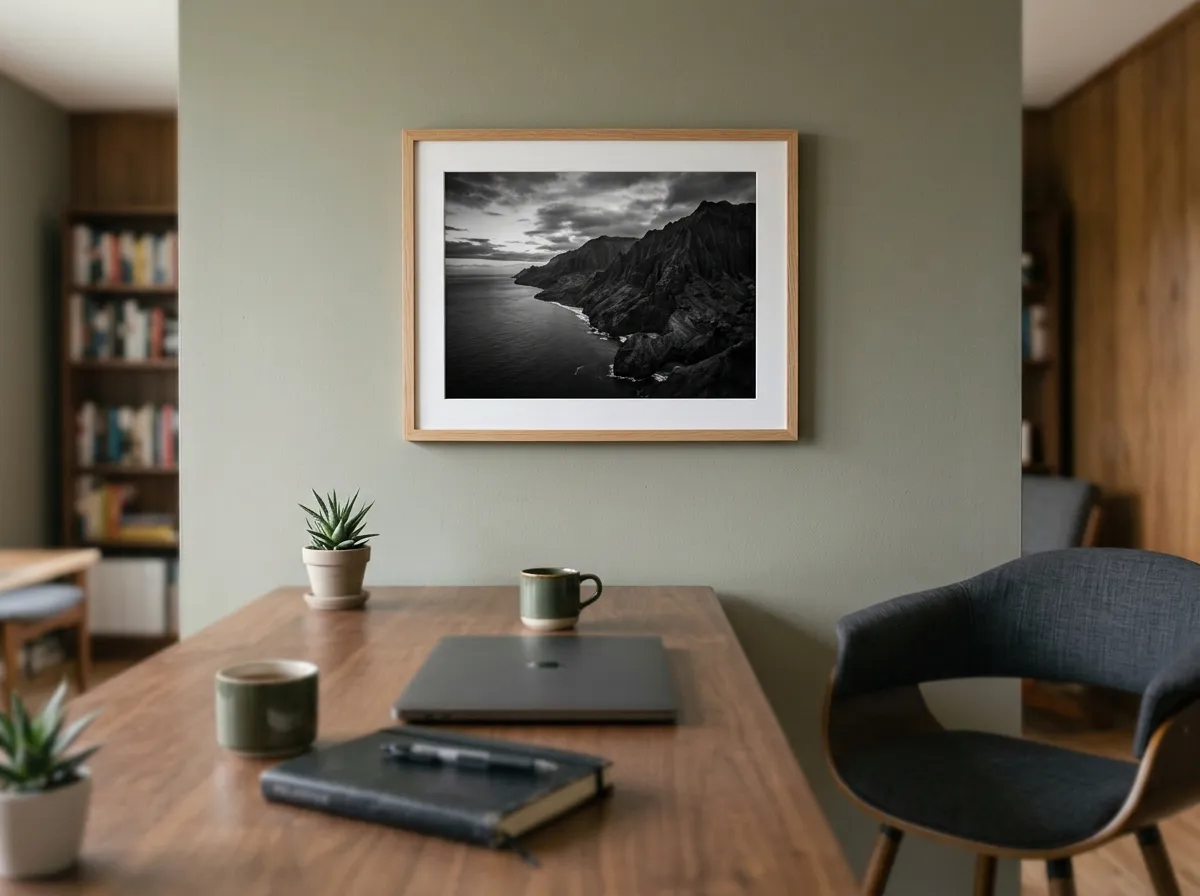
The most effective home office wall art strategy is the same one that works in bedrooms — one piece, correctly scaled, in the right position. In a workspace context, the anchor print sits directly in your eyeline when you look up from the screen. Not above the monitor. Not to the left or right. Directly ahead, at the natural resting point of your gaze when you lift your eyes from focused work.
This positioning is deliberate. Berman, Jonides, and Kaplan’s widely cited 2008 study in Psychological Science found that brief, effortless engagement with visually interesting natural scenes allows the directed attention system to recover — a mechanism the researchers trace to Kaplan’s Attention Restoration Theory. A well-chosen print at that height gives your focused attention a place to rest between concentrated tasks without requiring you to leave your desk.
For a standard desk setup, the anchor print should be roughly 24–32 inches wide. It should sit at seated eye level — approximately 47–49 inches from the floor to the centre of the print. Most home office wall art fails because it is hung at standard standing height (57 inches), which means you are looking slightly up rather than directly at the print when seated.
Nature and Landscape Home Office Wall Art for Attention Recovery
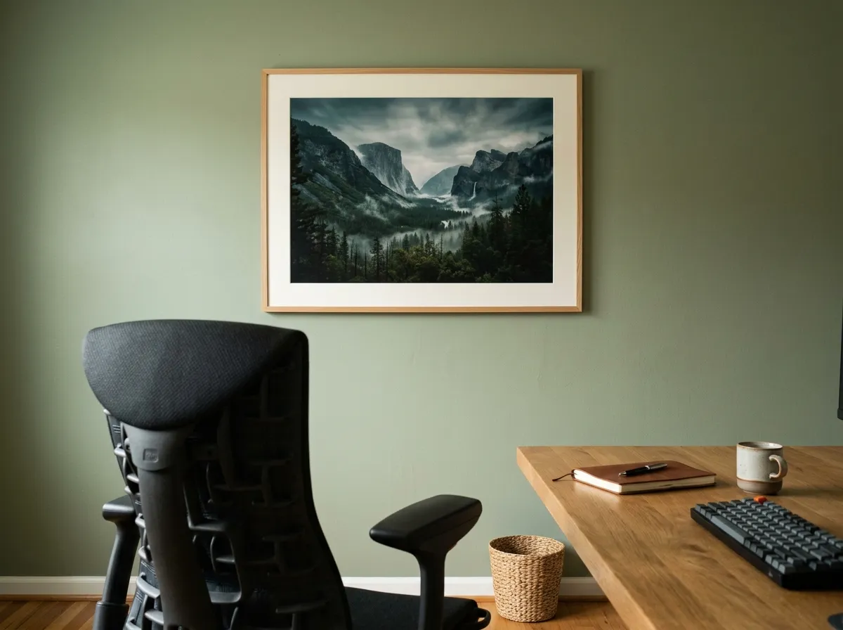
The most evidence-backed category of home office wall art for concentration is landscape and nature imagery. The Berman, Jonides, and Kaplan study cited above used photographs of nature specifically, but the underlying cognitive mechanism — Attention Restoration Theory, first proposed by Kaplan’s 1995 framework in the Journal of Environmental Psychology — applies to rendered landscape art as well as photography.
The mechanism is straightforward: natural environments, including representations of them, engage involuntary attention effortlessly, giving directed attention — the kind you use for writing, analysis, and focused problem-solving — time to replenish. A misty forest study, a coastal landscape in deep tonal range, or an ink-wash mountain scene provides exactly this kind of soft, effortless visual engagement.
The key word is soft. Highly detailed, high-contrast landscape prints overstimulate rather than restore. Home office wall art for attention recovery should have significant tonal range — sky, mist, distance — and a clear visual resting point.
Monochrome Home Office Wall Art for Minimal Visual Distraction
For text-based concentration work — writing, editing, coding, analysis — the most practical choice of home office wall art is monochrome. Not because black and white is more austere, but because it removes colour as a variable. Colour has direct physiological effects on arousal and mood: a warm orange print raises ambient energy; a saturated blue dampens it. Monochrome removes this variable entirely, leaving the workspace’s atmosphere determined by other factors — light, materials, temperature.
Analog-style black and white prints in deep tonal range (near-black through warm grey to off-white) are the strongest home office wall art choice for this purpose. The grain structure introduces enough visual texture to prevent the eye from sliding off the print entirely, while the restrained palette creates no active distraction from the work on screen.
Avoid high-contrast graphic black and white — pure black on white, bold patterns, or strongly architectural monochrome. These create a visual tension that competes with the screen. A tonal monochrome print with long gradients and atmospheric haze is the one that genuinely recedes rather than competes.
Abstract Home Office Wall Art for Creative and Strategic Work
Not all focused work is the same. Text-based analytical tasks benefit from low-stimulation, restorative art. Creative work — design, writing, strategy, ideation — can benefit from a different kind of visual engagement. Open, ambiguous abstract home office wall art gives the visual system something genuinely interesting to do during micro-pauses, which research suggests may support associative thinking.
The operative word here is ambiguous. Abstract art that reads as clearly representational provides too clear an answer for the eye to rest on. Abstract art that genuinely resists a single reading keeps the visual system engaged at the edge of interpretation rather than at resolution.
Charcoal-style studies work particularly well for creative workspaces because their smudged, approximate quality reads as perpetually unresolved. The eye returns to charcoal more readily than to clean linear work. Textured, mixed-media prints with strong directional brushwork serve the same function — visible process, open reading.
The View-Facing Wall — The Most Underused Home Office Wall Art Placement
Most home office wall art advice focuses on what hangs behind the desk or above the monitor. The most effective placement for attention recovery is on the wall directly facing you when you deliberately look away from the screen — in most home offices, the wall you turn toward when you rotate your chair or lean back.
Treating this wall as a deliberate restorative surface — choosing a print specifically for that position — is the closest a home office can come to replicating the cognitive benefit of a window view. Kaplan’s Attention Restoration Theory describes this quality as “fascination without demand”: visual interest that does not require active interpretation.
A 31×39 inch landscape print on this wall, chosen for tonal depth rather than compositional complexity, gives you a functional visual rest specifically available during the work day. It works whether or not you have a window, and in rooms where the window is behind you — a common home office configuration — it actively compensates for the absence of a meaningful view in your natural line of sight.
Small Format Home Office Wall Art on a Crowded Desk Wall
Many home offices have limited wall space — the desk is against the only suitable wall, shelving fills the rest, and the available surface area for home office wall art is a strip between a shelf bracket and a light switch. Small format prints, hung intentionally, work better here than forcing a larger print into an uncomfortable position.
A 16×20 inch print in a simple frame hangs comfortably in tight wall spaces without the overhang awkwardness of a larger piece positioned near obstacles. It still functions as a visual anchor if placed at seated eye level and chosen for tonal quality rather than size.
For dense desk walls, choose prints with a high proportion of negative space — a single subject centred in a wide tonal field. A small monochrome print of a lone tree in mist reads as a considered choice in a tight space; a small print with an all-over composition reads as a postcard.
Vertical Format Home Office Wall Art for a Narrow Wall or Alcove
Home office alcoves — the recessed space where a built-in desk often sits — are among the worst environments for standard horizontal home office wall art. A landscape-format print in a tall, narrow space reads as squeezed. A portrait-format print fills the alcove’s vertical geometry naturally, and in a workspace context, vertical compositions have the added benefit of keeping the eye moving rather than settling.
A 20×31 inch or 24×35 inch portrait-format print — a tall botanical study, a vertical ink-wash mountain, a standing tree in deep shadow — fills an alcove wall with appropriate visual weight without crowding. In an alcove, the art surrounds your peripheral vision while you work, rather than sitting in your direct line of sight — which means it should have lower visual intensity than a print you place directly ahead.
Home Office Wall Art by Work Type — Technique and Placement Guide
Different kinds of cognitive work call for different home office wall art choices. The table below maps common remote work types to the most effective print techniques, sizes, and placement approaches.
| Work Type | Best Technique | Size | Placement |
|---|---|---|---|
| Writing and editing | Monochrome, tonal | 24–32″ wide | Directly ahead at seated eye level |
| Data analysis / coding | Minimal, atmospheric | 20–28″ wide | View-facing wall, away from screen |
| Creative / design work | Charcoal or textured, open | 24–32″ wide | Peripheral wall — deliberate break surface |
| Strategy / deep thinking | Deep, atmospheric landscape | 31–39″ wide | View-facing wall, large enough to rest in |
| Video calls | Any muted technique | 20–28″ | Behind you in camera frame — one piece only |
| Small or alcove office | Monochrome or charcoal | 16–20″, portrait format | Directly ahead, with generous mount |
Muted Colour Home Office Wall Art for Sustained Concentration
Colour psychology in workspace design is consistent in one finding: highly saturated colours increase arousal, and sustained arousal impairs the kind of extended, focused attention that deep work requires. Home office wall art in a muted, desaturated palette — warm linen tones, cool grey-greens, dusty ochre — creates a lower ambient stimulation environment that suits sustained concentration.
This doesn’t mean the home office wall art must be colourless. It means the saturation level matters as much as the hue. A warm, impressionist botanical print — ochres pulled towards amber, greens desaturated towards linen — reads as warm and present without stimulating the nervous system. The same subject in flat, saturated digital colour would be actively counterproductive in a concentration environment.
Warm muted tones work better than cool muted tones in north-facing rooms, which already read as cool and slightly draining. Cool muted tones — grey-green, soft slate — balance south-facing rooms with abundant warm light.
Home Office Wall Art Behind the Camera Line — Video Call Backgrounds
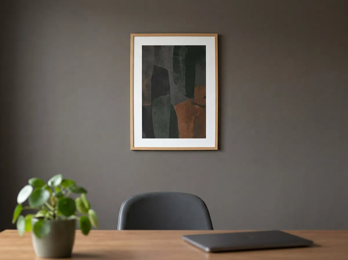
Since video calls became a daily fixture for remote workers, the wall behind the desk has acquired a function no previous generation of office design needed to account for: it is now a professional background visible to everyone you work with. Home office wall art on the camera wall is simultaneously personal decor and professional communication.
One piece of home office wall art in a muted, darker palette, positioned behind you and visible in the camera frame, works best. Not a gallery wall — the visual complexity reads as cluttered on screen. Not a pale or bright print — contrast with your face becomes a camera exposure issue in most home lighting conditions.
Triptych Home Office Wall Art Above a Wide Desk
For a standing desk or a wide desk configuration, a triptych — three prints in a horizontal row — or a single wide-format piece spans the desk width more convincingly than a single smaller print. This is one of the few home office wall art approaches where going wider genuinely outperforms a single anchor piece.
Size the full arrangement at roughly 35–47 inches across, with each panel in the same technique and palette so the three pieces read as one considered composition rather than three separate decisions.
Rotating Home Office Wall Art for Cognitive Novelty
Habituation — the process by which repeated visual stimuli become effectively invisible — works against home office wall art in a way it does not affect bedroom or living room art. You spend more consecutive hours in your home office than in almost any other room, which accelerates familiarity. A print that provides genuine attention restoration in week one may be functionally invisible by month three.
Maintaining two or three prints in the same frame format allows seasonal rotation without reframing. A landscape study in autumn tones for winter months, replaced by a quieter, cooler ink-wash piece in spring, keeps the restorative surface genuinely novel.
The Dedicated Thinking Wall — Home Office Wall Art for Deep Work
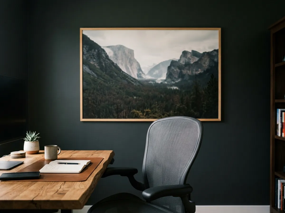
The most committed application of home office wall art for cognitive performance is what might be called the thinking wall: a single, large-format print on the wall across from the desk, chosen not for background decoration but as the primary visual environment for extended cognitive breaks. You stand in front of it when you are stuck. You look at it between deep work sessions. It is not art you glance at — it is art you visit.
A 39×47 inch or larger print — dark, cinematic, with deep tonal range and a landscape subject with genuine spatial depth — functions as a cognitive environment in a way smaller prints cannot. At sufficient scale, the print stops reading as a framed object and starts reading as a spatial reference: you look into it rather than at it.
This approach is less common in home offices because large-format prints are often assumed to be expensive. With a digital download, a 39×47 inch print costs the same as any other format — only the local print cost changes with size, typically in the $20–35 range depending on paper choice.
Recommended Products for Home Office Wall Art
Everything you need to source, frame, and hang home office wall art at the right scale, height, and finish for a focused workspace.
Frequently Asked Questions
Choosing Home Office Wall Art That Works as Hard as You Do
Home office wall art that genuinely improves focus has three things in common: it is placed where you actually look during cognitive breaks, it is chosen for tonal quality and subject matter that suits sustained concentration, and it is scaled correctly to the room it occupies.
Most home office wall art fails on all three counts — hung above the monitor at standing height, chosen for aesthetic appeal rather than cognitive function, and too small to do anything useful at the scale of the room. Getting any one of these right moves you into a different category of workspace. Getting all three right creates a space where sustained focused work is measurably easier.
Find Home Office Wall Art That Works →